For the fifth year in a row, we are organizing Summer Camp for web developers and other web professionals. Over time, our event grew organically. It evolved through widening the scope and the range of topics being covered. The branding also needed to be altered along the event itself. This is a short tale about our event logo evolution.
Dawn of the Summer Camp
Back in 2012, we started the Summer Camp event. Since our core business is developing websites upon eZ Publish CMS, it was the main and only topic we decided to talk about. It was meant to be a hands-on workshop-oriented conference for eZ Publish developers. As we are creative people, we named it eZ Publish Summer Camp :)
We come from the land of 1000 islands and we wanted our brand to be somehow connected to the sea, waves, and summer. Along with that, we used to have a paper boat illustration as the personification of our product.
Then we combined it all with Lobster 1.3, a relatively unknown typeface at the time. Since it radiates summer mood, it fit well in the logo.
Evolutionary pressure
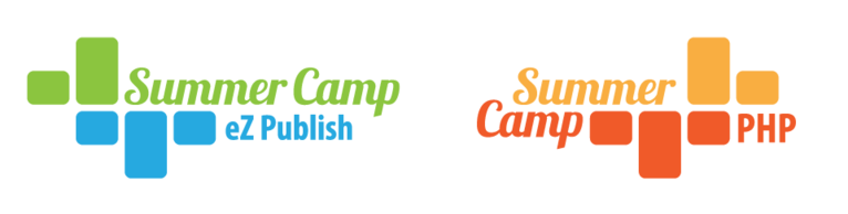
Starting with version 5, eZ Publish has been using Symfony full-stack framework including Twig as a templating engine. At that point, eZ Publish and Symfony communities suddenly became very close. Therefore, in 2014 we realized that it might be handy to introduce PHP as the new topic, with focus on Symfony. Nevertheless, I needed to rework our event logo because it worked well only on the web and we did not have a solid color version nor the positive or negative one.
Because of all that evolutionary pressure, we decided to add PHP Summer Camp along with the existing eZ Publish Summer Camp, making our conference a double event.
I wanted to create minimalistic and similar logos for the both events, but still keeping a visual connection with the old logo (that connection was achieved through the same typography). I decided to use the specific color coding for each event to make sure people don’t get confused. Green and blue for the sea and the pines, red and orange for the earth near the coast.
System to the rescue
This year we are introducing a Design topic as well, and due to it we were facing some new problems: What shall we do with the branding now? Does it make sense to create one more logo? What will happen to the branding in the future if we want to further add something new to the event? If we have multiple logos for the event, it becomes a problem to communicate that to the world. It is also a pain to produce all the visuals for the t-shirts and other goodies.
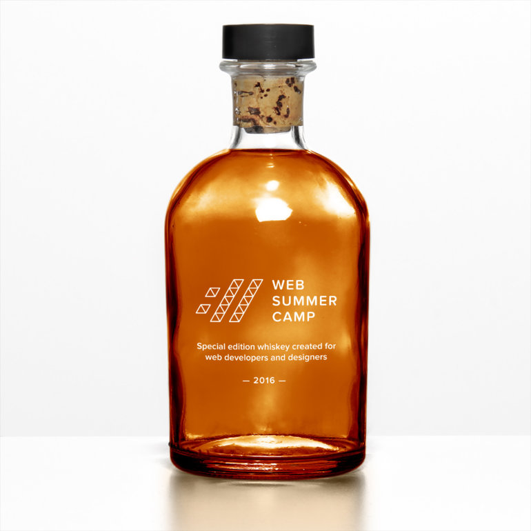
After some brainstorming, we concluded that we should merge all the topics we want to cover into one conference we named Web Summer Camp. But what about the logo? And what if we wanted to create another event, e.g. Web Winter Camp? How to approach the creation of such branding?
Obviously, we needed to devise a system, a set of clever guidelines for a logo creation. Such system should allow us to easily tweak the logo design or even create another logo upon it. All logos constructed from that system would have to be unique and yet they should correspond to each other in terms of visual language.
After consultations with other colleagues and periods of trial and error, I decided to use a grid-like structure as a display panel for the symbol part of the logo. The building element in our grid is an equilateral triangle.
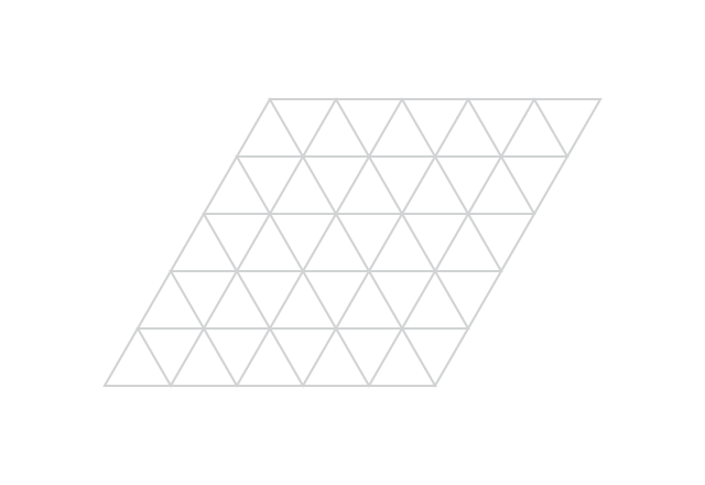
Now, we were thinking about what would be cool to “draw” inside our logo display panel. Actually, we argued a lot about the symbol we should use. In the end, we decided to use "://" from “http://www...” and we think it makes sense because, after all, “://” is all about the web, right?
After defining the grid, I defined the color palette. Three colors, warm summer mood. I love combining colors to palettes, it feels almost like combining notes to the chords - fun!
Since it is a good practice to keep things prepared for the zombie apocalypse situations (where the Earth is destroyed and no colors survived), we decided that we need a version of the logo that works well in positive and negative as well.
It is a good practice to have positive and negative versions of the logo in the case of watermarks, letterpress, engraved or embossed designs, etc.
And, last but not the least, typography. The symbol in our logo has pretty sharp edges so we wanted the text part to be, well, not so edgy. You know, just to bring back some balance to the Force.
Proxima Nova Soft is a versatile typeface that works well both in the headlines as well as in the body text and has been specially optimized for web use. The web is what we do, so I think it is a good match. It’s rather cool to use the same typography in the logo and on the website.
This is how the logo looks upon the grid with all the elements which define micro whitespaces, proportions, and minimal whitespace.
And this is how it looks without guidelines.
Now, I think this represents a good argument that one-color version of a logo might come handy here and there.
Bottom line
It is really helpful to have a system for doing things. Even if you are creating the logo, which is not really an analytical process since it involves emotion, mood, and other fuzzy components, it is still convenient to be able to rely on the system guidelines.
Let me give you an example. If we decide to create a different event in the future and want people to connect that event with our existing and (hopefully) well-known branding, we will simply use our system, put another symbol in the panel, choose another palette, and change the name of the event. Here is one possibility, as simple as that.
There is a lot more to say about the logo design. I simply wished to introduce you to our way of thinking and working while changing the look of Summer Camp logo over the years. I enjoy logo design and coupled with web design it becomes a neat dynamic playground in which you can be creative in so many different ways. I hope I managed to show you how fun it can be. All your suggestions and questions are more than welcome!