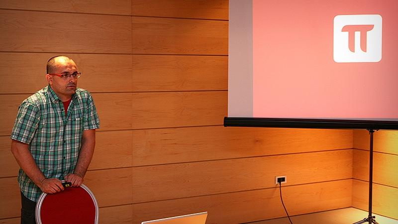
This is a re-post of our partner and well known UX designer Marko Dugonjić. He held a workshop about responsive design at the eZ Publish Summer Camp so he shares his view about the event and eZ Publish in general. The original post can be found here. - Ivo
Ivo LukačThis is a re-post of our partner and well known UX designer Marko Dugonjić. He held a workshop about responsive design at the eZ Publish Summer Camp so he shares his view about the event and eZ Publish in general. The original post can be found here.
Just came back from the first edition of eZ Publish Summer Camp in Bol, on the island of Brač in Croatia. The event went pretty well, so a big congrats to team Netgen and associates for pulling-off the biggest unofficial eZ camp so far.
I was invited to hold Responsive Web Design workshop at cms track, intended for intermediate to advanced eZ Publish developers. It was a joy to speak about rwd to a slightly different audience than usual (i.e. designers and front-end specialists). The design deconstruction exercise was especially interesting, and it proved once again that anyone can be taught how to observe and analyze visual design.
When we had discussed about the workshop for the first time, the official demo site was designed as a traditional fixed width layout. In the meantime the latest version demo has been built with responsive web design, but there’s a room for improvement. The demo is done with Bootstrap from Twitter. And while it is not the worst framework out there, it’s still a framework and as such brings unnecessary weight around the waist.
Responsive web design is easy to develop once you understand the process. That was the reason why we opted to focus on the process at the workshop, rather than just provide the out-of-the-box silver bullet copy-paste examples. rwd can be achieved with just a few lines of css, so using a framework — any framework — is obvious overkill. A big step-back in this case would be trying to learn how the framework works in order to develop such a basic and straight-forward design system such as rwd.
Over the years, eZ Publish became quite powerful and robust enterprise level cms. However, compared to other popular solutions, for instance Drupal or WordPress, the lack of clear design direction and limited variety of showcase level front-end designs, makes it difficult to sell — especially to design agencies that are traditionally a great channel for advocating any cms to clients.
Content-driven sites are all about fine-grained control over content organized into a matrix of information silos, neatly wrapped into great reading experience and easy to use browse and search patterns. While the former is quite well done in eZ Publish, the latter has been neglected up until recently. I had a chance to talk to a couple of influential members of eZ Community and a part of the product development strategy is to focus more on the quality of interface, starting with a number of usability improvements. And indeed, informed front-end development and diversity in UI design should be the natural next step for eZ Publish community.
