Mobile devices have changed the way we consume the online content everyday. In this post (first out of two), we are proposing ways of using eZ Publish as a platform in different mobile web strategies.
These days, mobile seems to be the mother of all buzzwords in the web development community. The blogosphere is bursting with advices on the best mobile strategy, design community battles with evergrowing number of different devices that are accessing web pages and more and more media creators are pushing their content through different channels and devices. And I think that this buzz is here for a good reason.
You can trust the reports such as the Morgan Stanley report (more than a year old), or you can just take a look around you while sitting in any coffee house, bar or hotel lobby and see the growing number of people staring at the screens of their mobile devices. Mobile web / Internet usage has gained enormous momentum in the last few years and has pushed itself into becoming one of the mainstream ways of consuming the online content.
In the eZ Publish community, we need to keep up the pace with these changes, and provide our clients with the right solutions for this brave new and mobile world we are living in. I believe we have all the tools needed.
The main features of eZ Publish that enable us to develop different kinds of mobile solutions are:
- clean separation of design and content
- flexible content model that we can leverage to model the data to our needs and
- rich and well-defined APIs that we can use to access the CMS and integrate it with external systems.
By utilizing these features eZ Publish developers can choose one or more different approaches for enabling mobile access to the content stored in the CMS.
Mobile approach no.1: responsive web pages
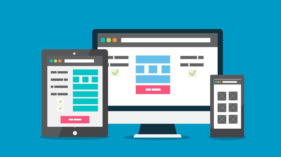
One of the currently most cited and discussed approaches to solving the mobile problem originated with the excellent A List Apart article by Ethan Marcotte. The author argues that in today’s world of almost chaotic change in number and types of devices accessing the web pages it is not enough to limit our approach to desktop (or better said, big screen devices with horizontal resolution usually greater than 1000 px) and standard mobile phone device (small screens with 480 x 320 px or similar resolution). The solution proposed by the author is a combination of fluid grids, flexible images and CSS3 media queries that enable the designer to build layouts that use the same HTML content, but in a dynamic manner so that the web page adapts itself to any device resolution. This “one content to rule them all” solution relies on HTML / CSS client side code and is, in general, agnostic to server side technologies used. eZ Publish, with its clean separation of content and presentation, excels in providing the front side developer with just that kind of clean markup. Just remember not to use fixed pixel sizing in your content and templates!
Mobile approach no.2: dedicated mobile web sites
Contrasting the responsive web pages approach, we have the solution where a “specialized” mobile site is created for the small screen devices. Usually, some kind of device or feature detection is used on the server or the client side and a client accessing the site is redirected to the appropriate version, the mobile one often being set up with a different hostname on the same domain or URL suffix (www.example.com/mobile or m.example.com). Although not as popular nowadays as the responsive solution mentioned above (at least among top-notch web designers and developers, doubtfully if comparing the number of sites in production), we still believe that this solution has its place. The most important factor in choosing which approach to take is to consider the context in which the site will be commonly used. This reasoning has its flaws, as sometimes a user just wants to use the mobile device to access the same content while sitting in front of the TV, but one can argue that benefits of making a specialized site version for the mobile user can make it the right thing to do.
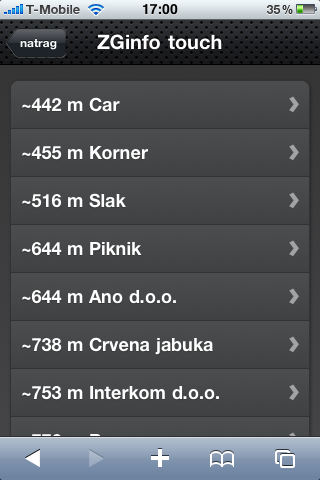
For example, one of the sites we developed, which is also one of the largest Croatian yellow pages sites, provides radically different experiences when accessed by desktop or mobile device. When a desktop client accesses the site, a rich user experience is provided, which augments content about the businesses in the catalog with additional information such as user-generated data (user comments, rating), image galleries etc. Contrasting this, when a mobile device accesses the same site, the focus is much more on the content and data regarding the business, avoiding all the unnecessary information that could degrade usability when presented on a small screen and possibly using higher-latency, lower bandwidth Internet connections. Additionally, geolocation capabilities, that are available in most of the current mobile browsers, are used to enable simple spatial features such as providing the user a way to quickly find the nearest business (depending on his/hers position), providing routing information, etc.
On an eZ Publish installation, making a separate siteaccess for a mobile site is a trivial effort, and the only thing we need to do is to ensure that we provide the appropriate device / feature detection. Also, if you want to include geolocation features to your mobile (or desktop) solutions, check out our previous post.
In this post we presented two ways of creating mobile solutions built on eZ Publish, both based on standard web technologies such as HTML, CSS and JavaScript. Opposed to this is the approach which implies using the native mobile application (and not the mobile browser) to access the data stored in the CMS. As we will present in the following blog post, eZ Publish provides all the necessary tools needed in this case as well.
Photo credit: Designed by Freepik


