Adriatic osiguranje is one of the leading insurance companies in the Croatian market, with more than a quarter of a million clients recognizing it as a company that provides a comprehensive, fast and efficient insurance service. Such a company deserves a representative webshop, so our team stepped in to develop a brand new e-commerce platform and provide faster and simplified insurance contracting.
Our UX team kicked off the project with the discovery workshop market research to detect specific project goals. The whole project was implemented in an iterative fashion, introducing specific insurance products to the platform one at a time. Travel insurance seemed like a good place to start, considering it already had achieved certain online sales.
The project was carried out by an agile team, focused on implementing the most valuable items from the backlog. In fact, the entire team was set up right from the beginning; web development teams both for frontend and backend, as well as the experts for UX and design, content creation and digital marketing.
Challenges on the way
Of course, there were several challenges while implementing the project.
First, our entire team had to have a crystal clear understanding of insurance regulations and its specific terminology. Such content and terminology had to be organized and presented in a way that remains understandable to all users and does not discourage them from the purchase, especially because there is always some other insurance company that they can easily turn to.
That brings us to the second challenge, which is predominantly related to UX. It was necessary to come up with a UX solution that would simplify what is usually a complex process of insurance contracting and make it direct and straightforward for the user. In order to achieve that, we had to go through rigorous user testing and various design iterations to finally come up with the solution we were looking for. You might remember our Tomato case and a similar process.
Third, it was important to choose adequate technology to achieve the best results. Having in mind the specific customer journey and the complexity of numerous options needed to be ready and available, it was necessary to carefully adjust technology while understanding the specific project needs.
And finally, Adriatic osiguranje was already rather popular in the vehicle insurances segment, but we also wanted users to know that there were other types of insurances available. This is where the digital marketing tools jumped in to boost the webshop visibility and conversions.
Discovery workshop and goals setup
The project started with the initial workshops and market research. During the entire time, we worked closely with the Adriatic osiguranje team to clearly understand and define the goals of the project. At this stage, it was crucial to understand and map out important customer journeys and create main user personas.
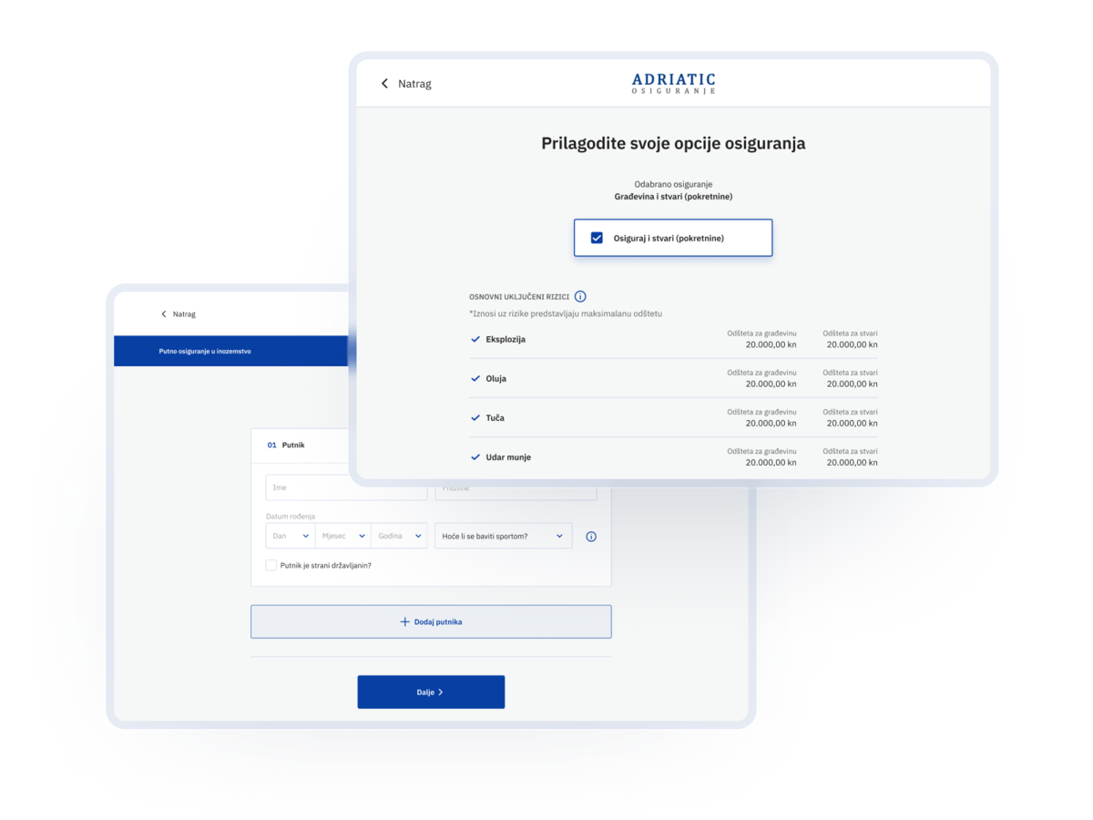
Various wireframes in Figma were developed following those workshops to help us decide on the final options before the development phase. Each step was carefully tested and evaluated, before starting with the next phase.
The technology behind the project
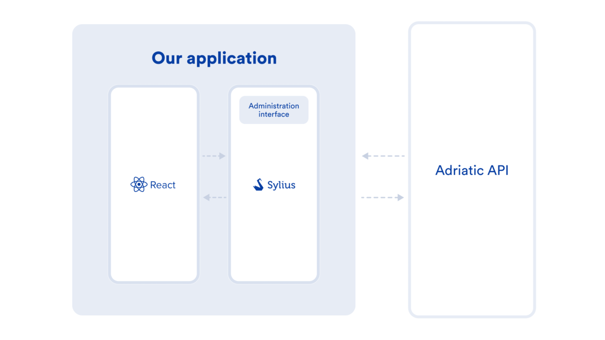
With regards to technology options, we decided to use the Sylius eCommerce platform based on Symfony PHP framework for the backend and React Javascript application for the frontend.
Considering the webshop of Adriatic osiguranje is a shop that sells a service rather than a physical product, which also always differs from one user to another, the entire shopping experience needed to be completely customized. Sylius eCommerce framework, which we have a lot of experience with, is one of the Symfony based frameworks with a growing community that offers enough flexibility for specific requirements of the project.
Sylius also made it possible for us to additionally adjust an intuitive interface for administrators who can now easily keep track of the sales and statistics. With Sylius for the backend and React on the frontend, the entire webshop was also integrated with Adriatic osiguranje API that takes care of business logic.
With regards to the frontend, React JavaScript application allowed us to create a solution slick enough to “lead the user by a hand” while also providing a responsive, modern and simple interface.
Each step of the process was automated and covered with enough testing in order to reduce any mistakes and regression bugs during the development of new features. Finally, we made sure to give the webshop a push through several digital marketing tools, such as Facebook and Google campaigns.
The webshop continues to grow
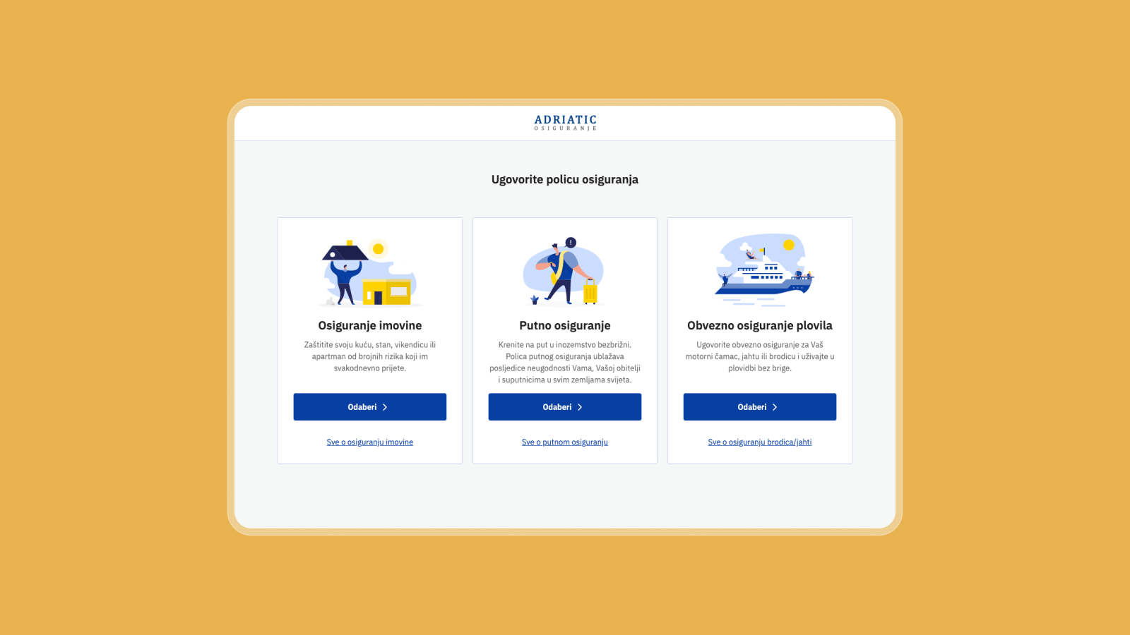
We have completed the first part of the webshop with now available insurances for travel, property and vessels, but the webshop continues to grow. Besides that, we are constantly following and tracking if there are some features that should be improved.
Despite the fact that people are still travelling less due to the pandemic, the webshop managed to achieve good results, marking the growth of travel insurance online sales ten times in comparison to the previous year.
However, this isn’t the end of the project. Rather than that, it just stepped into the next phase. Netgen continues to work on additional types of insurances that are currently still in the testing phase, but you can expect them to be available quite soon.


