Want to mingle and have a great discussion with famous typeface designers? Want to learn about web design, front-end development and web typography? If that is the case, Kerning Conference is a great conference for you to attend.
Faenza, Italy. Excellent wine, outstanding cuisine and, of course, typography. Sounds good, doesn’t it? :) Well, it is as good as it sounds. I went to a Kerning Conference and it was a blast! Want to mingle and have a great discussion with famous typeface designers? Want to learn about web design, front-end development and web typography? If that is a case, Kerning Conference is a great conference for you to attend.
Responsive Design: Clever Tips, Tricks And Techniques
The first part of this full-day workshop, held by Vitaly Friedman, a Smashing Magazine editor-in-chief, was oriented to the User Experience. We learned how to approach designing responsive websites from a UX point of view. Vitaly gave us a bunch of examples and smart exercises to tune our minds. An insight to the complex problems that might occur in the design process of a big multi-lingual sites was given and elaborated. We were looking into some specific parts (or modules) of the website and we were discussing their behaviour in the fluid environment.
Afterwards, in the second part of the workshop, we shifted to the practical world of front-end. Tips, tricks and really cool techniques were presented to us, and I can tell you, they were all clever :) We learned how important it is to optimise a website for a poor internet connection and we discussed how to approach that issue. Vitaly was really keen on illustrating how smooth CSS can be if flexbox is used. This guy has the ability to convince you to believe in what he believes.
Conference Impressions
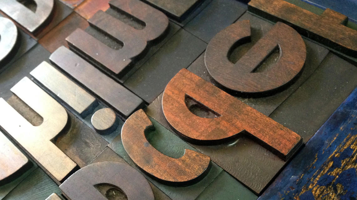
Recapturing the Essence of Hand-drawn Lettering Through Typeface Design - Laura Worthington
Laura opened the conference with an insight to the process of designing the script typefaces. It was astonishing to learn how complex it is to construct a set of characters, ligatures, swashes and alternates in order to create a script typeface which does look like a real handwriting. Laura explained how she introduced subtle imperfections among the characters to achieve a more organic look and feel. An excellent lecture and really great typefaces by award-winning typeface and lettering designer.
In Letters We Trust - Tobias Frere-Jones
A remarkably interesting lecture on lettering used on the money bills, American banknotes and lottery tickets to prevent forgery. Tobias showed a lot of slick approaches used to aggravate an attempts of falsification from Benjamin Franklin’s period to the present day. It is fascinating how deeply Tobias went in his research in order to present these facts.
A different way to tell stories - Marco Goran Romano
What do you get when you amalgamate illustration, typography and graphic design? Marco, an outstanding award-winning illustrator introduced us to a world of visual storytelling. He pointed out important tips and pitfalls in the process of design and elaborated on the techniques needed to express a tale through the visual experience.
Improving Web Fonts Performance - Vitaly Friedman
Web fonts can be heavy. Internet connection can often be slow, especially on mobile devices. Loading of a website can take a while. Vitaly explained how important it is to have performance consequences in mind while designing a website. He proposed several smart techniques to improve web fonts performance. As always, Vitaly presented a bunch of really useful tips and clever approaches which can be used in order to minimise the performance issues.
Fonts, fonts, fonts - Indra Kupferschmid
How to choose a right typeface? How to combine typefaces? What is legibility, and what is readability? What is important to think of when designing for the screen? What about browser rendering, control over hyphenation, built-in kerning, faux-bold and faux-italic? All this and much more was brought to the audience by Indra Kupferschmid, a typographer and professor at HBKsaar. I’ll just point out six takeaways for selecting typefaces:
- Choose a genre fitting your intended atmosphere
- Look beyond common safe bets
- Use fonts at their appropriate size
- Test typefaces with your content and tech
- Check quality/rendering across platforms
- Support your foundries, don’t steal their fonts
Architecting Information - Oliver Reichenstein
The philosophical vision of the information architecture and interface design by Oliver gave the audience the chance to rethink typography from a different perspective. Just like old masters do, Oliver used allegories to explain that everything has an interface in a given situation, typeface including, and that the interfaces can be altered by passing the thresholds. Interesting approach, interesting lecture, interesting lecturer.
Too Big to Fail - Nicholas Felton
Nicholas tracks his life. He has been producing “annual reports” since 2005. He has been trying to describe his life using data visualisations. Last year he managed to track all his conversations, phone calls, emails, SMS and chat messages. Even though this is an unusual thing to do, the usual problems of working with such a great amount of data are present. Nicholas shared his approaches and techniques in taming the data, categorising it and visualising it.
What lies beneath - Bruno Maag
This was an outstanding performance and a striking lecture. Bruno, a respectable well-known typeface designer, came to the stage. He put on an apron and drew a gigantic butcher knife from somewhere. After wielding it for a few minutes, he got everyone's attention and explained what lies beneath. On the example of his own project, designing a typeface for Lush, he illustrated how much hard work is behind something that looks like a simple innocent playful typeface. He pointed out that a successful design project is never a result of an individual, but of a team. He shared a bunch of useful tips and kindly asked not to steal his fonts while holding a knife in his hand.
Conclusion
Anyhow, the conference was just great. I learned much, but what is more important is that some of the ideas and skills that I already knew got reconfirmed.
And the last, but not the least, I want to thank the organisers, they did a great job.
Here is a gallery with some photos from the conference. Feel free to tag, share and comment.