After using the old eZ Publish administration for more than a decade, it seemed that the journey will come to an end. The new eZ Platform UI revolution should have put the old dog out of business by now. That hasn't happened yet, so we gave this old dog a new life in such manner that it could still be used on many projects.
The eZ Publish administration interface
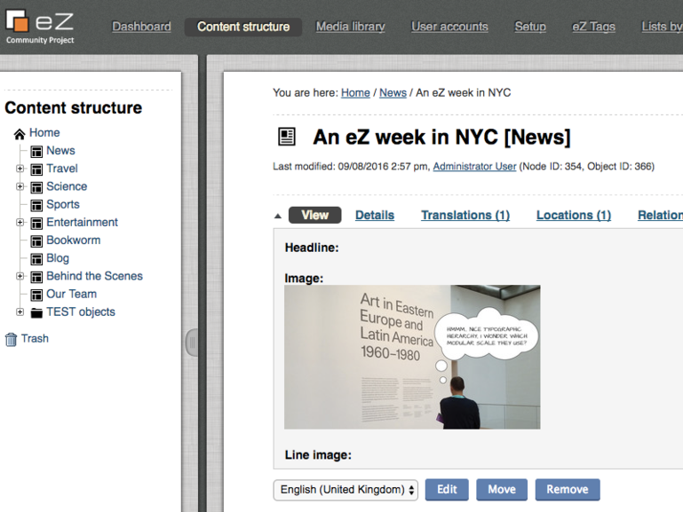
Roughly 15 years ago, eZ Systems revamped their CMS, released the new version 3 and designed a new admin interface along with it. This was the interface we used with our first eZ-based projects in 2004/2005. It was not the prettiest nor the slickest one, but it did a great job on projects with lots of content and a complex information architecture. This interface had a tree-based content structure, extensible content model, and numerous other useful features for bigger projects.
Over the years, the visual appearance of the interface was improved with every new iteration of eZ Publish 4 and 5 versions. The performance improved as well with adding more AJAX-based components for tree, listings, etc.
The most important aspect of this interface, at least for us, was the fact that it was built with the same technology used to build the frontend. The basic structure and features were implemented mostly with eZ templates. This administration interface was a terrific learning resource which also enabled very simple extending possibilities for extra features and project-specific functions. Many extensions were built by the community and eZ Systems themselves along the years, like our well-known eZ Tags.
There were also some problems with the interface which we encountered quite often. Vjeran wrote a summary of these UX issues a while back. Most of them were actually not that big and could have been fixed, but eZ Systems has already been focused on the new generation – eZ Platform UI.
eZ Platform UI
In 2011 eZ Systems decided to rewrite the whole eZ Publish code. That was a tremendous effort with a lot of good choices and a few not-so-good ones. For example, going with Symfony was, in my opinion, an excellent call. It enabled focusing on the CMS features and not on reinventing the code on the framework level. I wrote about the topic last year.
Since the old administration interface was built using the legacy code, the new Platform UI needed to be implemented on the new Symfony-based code to get rid of the legacy stack completely. Given that the new stack Public API was designed in a way that was simple to create a REST API on top of it, and given that eZ Systems had had some experience with AJAX and the client-side components before, the idea emerged to create the new editorial UI as client-side web application utilizing the new REST API. The new Platform UI should have been a modern and slick interface showcasing the SPA architecture, fast and easy to use.
During 2015, we started checking out the alpha and beta versions of the new UI. They lacked many of features we needed to use it on our projects but we still wanted to contribute. We tried to implement eZ Tags as a field type. However, that turned out to be quite difficult. I regret now for not testing the interface and warning about the problems earlier.
By the end of 2015, we finally got the eZ Platform 1.0 (the first version of the CMS with no legacy dependencies and with the new Platform UI). It was a clear signal for the community to start using it on real projects which some of them did during 2016. Since mid-2016 I have been hearing lots of complaints regarding Platform UI on Twitter, Slack, and other channels. Talks about problems continued at Web Summer Camp and even further at the eZ Conference in Paris. Nevertheless, we started the crowdfunding campaign to finally add the taxonomy features to eZ Platform UI with our Tags Bundle. Even though we still haven’t used the new UI, there were other agencies that needed such feature and we wanted to add some value to it.
At the beginning of this year, eZ Systems announced they need to rethink the architecture of the Platform UI.
I would like to give my opinion on the main reasons why the current Platform UI was not accepted well in the community. Of course, it is easy to be wise after the event, but I think it is important to analyze things in order to make better decisions in the future and not make the same mistakes again.
eZ Systems made several wrong choices regarding the new editorial UI. Here are the most important ones:
- Given the amount of work needed to implement an interface (which proved itself true during the years), the first mistake was a significant underestimation of the work. eZ treated the interface as one of the modules of the system while in reality it is easily half of the work.
- This was amplified by the fact that they wanted to build the new interface with a technology with which they haven’t had much experience nor resources. Yes, they did some work with YUI components in the old administration, but that was not adequate.
- They chose the architecture with which they didn’t have much practice. This is clearly shown by the fact that the eZ Platform REST API was not adapted for SPA usage. There should have been a higher level of API that handles much more with a single endpoint and not a very chatty API that produces 400 calls for a single page. A great example of how fast a REST consuming interface can be is the CJW proof of concept of an admin interface based on AngularJS and, you guess, a higher level REST API. Some might say that the choice of YUI was also bad. I would say that the choice made some sense due to the earlier experience with it, so it was just bad luck that YUI was announced end-of-life. The main problem was the overall architecture, not YUI.
- Last but not least, when the choice was made to base the new versions of eZ on Symfony PHP framework, eZ Systems seemed to forget the main strength of the old administration interface, mentioned before: it was built with the same technology developers use for the frontend. Maybe there was a prediction that all sites will by now be built only via SPA and REST. However, that didn’t happen. While switching from eZ legacy code to new code, we learned Symfony. New developers that are now joining the eZ community are mostly Symfony developers. Still, the new editorial interface turned out to be difficult for them to customize.
In the last half-year, I heard a lot of complaints about the new Platform UI. The most important ones are here:
- Slow (due to fat JS layer and hundreds of REST calls)
- User experience not at an acceptable level (too many clicks to do something, etc.)
- Small number of features (especially from people who used the old administration)
- Very very hard to extend
Features can be added, slowness might be reduced with adding a higher level REST API (or by introducing embedded REST calls or supporting GRAPHQL), user experience could be tuned, and it might get a bit easier to extend it over time.
Nonetheless, the main problem would remain: inadequate architecture.
A CMS that wants to be the Symfony-based CMS of choice needs to be implemented in a way to let Symfony developers handle and extend it in any way imaginable. Like the old admin interface, the new Platform UI should be the prime example of what is possible to do with eZ Platform. Showcasing SPA is a valid point, but only for parts of the system, like the landing page management or editing mode, and not for the whole interface. And by using Symfony as a basis, they would have had more resources to implement other features.
Easy to say now, I know.
There is a saying that the one who works makes mistakes. What is important is to learn from those mistakes and make the next thing better. Taking all this into consideration, this is what I think eZ Systems needs to do in the short term:
- Make the existing version of Platform UI work with backend Symfony-based routing so it is easier to add new Symfony features to it without hassle (AFAIK this is in progress)
- Revise all extension points, most importantly the making of a custom field type and doing it in a way that Symfony devs can find their way around. This will require a complete revamp of the editing mode and a lot of work, but there is no other way.
- Decide what kind of higher level of REST API to use and implement it
- Choose a new client-side framework and start removing dependency on YUI (however, the community should be able to use other client-side frameworks when extending the UI)
This is just the start. There are many more things to solve and refactor, but those listed above should be the priority. It is important for eZ Systems to show constant progress on a monthly basis in order for the community to see the light at the end of the tunnel.
Hopefully, the community will have a version 2.0 of eZ Platform UI by the end of the year that will be faster and much easier to extend, with more features and the biggest UX problems solved.
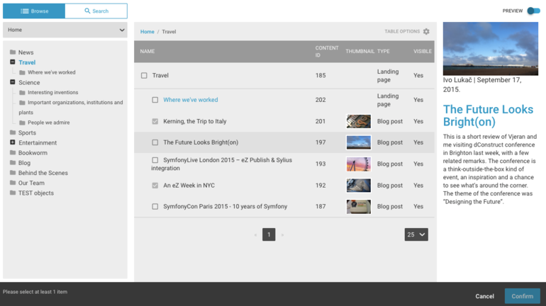
Besides crowdfunding and implementing Tags Bundle for the eZ Platform UI, we have also been considering open sourcing a few other components that might be useful to the new version of the Platform UI. For example, we implemented a Content Browser interface which is a lightweight and easily extendable component for selecting one or more items from a backend.
Naturally, one might argue that the work eZ Systems needs to do is too complex and that it would be better to simply start from scratch, but given the situation that would be a pretty hard decision to make.
Netgen Admin UI
At the beginning of 2015, we decided we need to build a completely new layout and block management system. More information can be found in the blog post on the topic. As we wanted to implement our management system on Symfony and the new eZ stack, we encountered a problem: there was no administration interface on which we could base our new solution. The old administration was pure legacy code and the new eZ Platform UI was neither ready nor easy to extend yet.
Therefore, during the summer of 2015, our “first attack” team led by Edi made a proof of concept to see if it would be possible to make the old administration hybrid so we could build new features using the new stack and Symfony (hybrid meaning that the siteaccess has legacy mode configuration set to false and that all layout templates are in Twig). With our experience in building hybrid eZ websites, it wasn’t very difficult to actually make it work. Of course, we added several features along the way to make our administration even more useful. For example, we implemented a simple menu plugin system which made it possible to add a legacy module and new Symfony routes to the main menu.
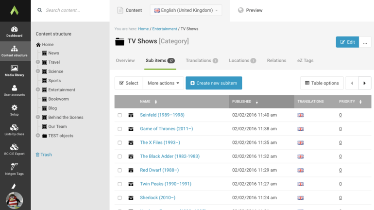
So, we proved it is possible to make it work but we still had one more problem. Well, it was 2015 and the old administration didn't look up-to-date. And the issue wasn’t just about the looks, as Vjeran wrote in the aforementioned post. Since we overrode the layout with Twig templates, there was no reason not to change the markup. So we did it. It took a while, but Vjeran and others maid it happen and we ended up with a modern looking interface and fewer UX problems.
We started to roll out our new admin UI to the clients at the end of 2015. There were no significant problems and the adoption was smooth. We used it with the latest 5.4 versions and our variant of the community edition. Later on, we switched to eZ Platform with Legacy Bridge where it works as well.
As mentioned in the intro, we gave the old administration a new life, the main point being that the existing projects that are now on the eZ Publish 5 installation and not migrating to eZ Platform UI anytime soon might get a solid UX improvement. We didn't change the code much, it is still 99% legacy. On one hand, there is no new rich editor introduced with eZ Platform UI, there is only a legacy datatype without the Alloy Editor, but on the other hand, all legacy extensions should work.
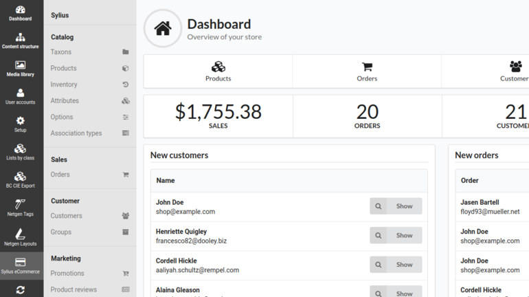
The Netgen Admin UI serves for the migration period during which those old legacy extensions can be refactored into the new stack and Symfony. Just to demonstrate how far it is possible to go with the new stack – we integrated the whole Sylius administration interface inside the Admin UI based on our eZ and Sylius integration.
To conclude, Netgen Admin UI is an interface based on the old administration that mostly falls back to the legacy code and templates but has two main improvements:
- The page layout and main menu are implemented with Twig and the new eZ stack, so it is possible to implement or integrate both Symfony and new eZ stack features.
- Some markup and CSS were overridden so that the UI gets a modern visual appeal and solves a few UX problems.
Still, there are also two main drawbacks:
- It's still 99% legacy code, therefore it will probably not be used on the newer versions of eZ Platform that will introduce breaking changes in the database model.
- It doesn’t support the new rich text field type interface with Alloy Editor.
Evolution or Revolution
So, there you go. Sometimes evolution is better, in other cases it’s revolution that is more effective. Given all our projects and clients, the evolution made more sense to us. The hybrid approach gave us time to adapt and a way to transition the administration interface.
Looking at the other side, eZ Platform UI revolution still didn’t deliver. eZ Systems is now pivoting to meet the target. The whole community wishes it would happen soon, like we do. In the meantime, we will be using our Admin UI.
UPDATE #1 – March 14th
As I mentioned earlier in the post, eZ Systems had recognized the issues at the beginning of the year and after getting feedback from the community decided to act on them. Overall direction and the next steps were announced at the end of January. They set to revamp the UI to be mode hybrid in order to make it easier for the Symfony developers to extend it.
First report on the progress was published at the end of February. Besides transitioning to Symfony 3, which is important as well, the work related to revamping the UI was focused on sandboxing components like UDW and item listing and prototyping new content editing using repository forms.
Eager to hear more. :)
UPDATE #2 - June 5th
We decided to go public with the Netgen Admin UI and eZ Platform UI v2 has hit alpha stage.
UPDATE #3 - December 2018
eZ Systems released the eZ Platform UI v2 stable. It features a different architecture than UI version 1 with pure Symfony enriched with React. This will enable us to customise and extend eZ Platform much easier - great news!


