In 2019 Tomato.com.hr won SoMo Borac award for the best website in the previous year. Here’s how we designed its user experience and developed frontend together with our friends from Locastic.
Back in September 2018 A1 digital team invited Netgen, Locastic, OptimIT and CROZ to redesign the Tomato website. The goal of the project was to automate user processes and boost online sales without losing the focus on user needs. While OptimIT and CROZ were in charge of backend development, together with our friends from Locastic we designed user experience and developed frontend.
Although this project followed as a logical part of our 10-years long cooperation with A1, it did bring some new challenges. The main challenge was definitely the number of companies and dislocated teams involved in its implementation, especially considering the fact that some of these teams worked together for the first time.
Understanding the limitations of the project
It all started with discovery workshops. Together with A1 digital team and stakeholders, we focused on identifying typical user groups as well as on understanding Tomato’s market positioning and business goals. Actions that followed where mapping user journeys, identifying all user scenarios and their variants (we detected 27 of them!) that could occur while switching from prepaid to postpaid, moving from another network to Tomato without changing a phone number, etc.
This enabled all engaged parties to understand how things work and which processes should be automated and integrated.
Since we were in charge of creating a user experience, the most important thing for us was to understand technical limitations of the system the solution is implemented on as well as to detect operations that take more time. In addition to that, there are usually different formal limitations and business limitations that need to be detected in the early phase in order to reduce unnecessary directions while designing user interaction. For example, as much as we wanted to make the process as smooth as possible, we couldn’t skip steps that are necessary for a user to take a postpaid service, such as entering Personal Identity Number or ID number. Having that in mind, we focused on explaining to the user why we ask this information.
We analyzed the existing communication with users in order to detect ambiguous or unclear messages and to improve them in the following iterations.
Let’s design together
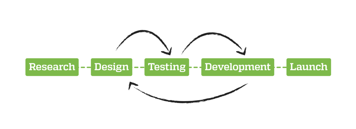
When it comes to user experience design, the key thing was iterative work on UI prototype that included usability testing.
Since A1 digital team uses agile principles in its projects for years now, we had the privilege to analyze and comment prototype as well as to align expectations and discuss possible approaches with the development team and stakeholders from the earliest phases. Although these were lo-fi prototypes, they enabled us to test different approaches and estimate implementation costs efficiently.
The usability testing was conducted within one sprint, during the phase in which the UI prototype already supported five most common user scenarios. The prototype was tested through interviews with typical users. The goal of the interview was to get the insight into the navigation structure and the offer itself, as well as to get user feedback related to mentioned user journeys. During design iterations that followed, we fixed issues and weaknesses detected through the testing.
Project development process
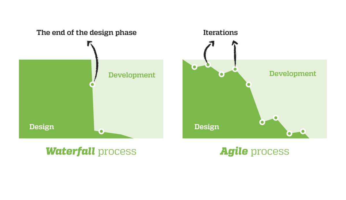
The whole project was based on the agile principles of Scrum. Although scrums, sprints, planning and retrospectives sometimes seemed too formal, they were crucial for achieving high productivity in a situation with more dislocated teams developing a complex project.
A few iterations were needed for teams to get to know each other and communicate effectively. Having a great project lead in A1 digital team helped a lot in coordinating teams in order to meet our shared goal.
As a result of this, colleagues from Optimit, who were in charge of ecommerce backend development, were very proactive in the process of creating user experience and defining user needs. No one was working within rigid roles or inside strong boundaries typical for waterfall processes where design is often based on wrong presumptions and without any feedback from the development team.
Results
The website was launched in March 2019. Automating or simplifying many processes, such as moving from one mobile network to Tomato, or switching from prepaid to postpaid, was the goal we knew we met, however, a few months had to pass to check if the numbers prove this.
Speaking in numbers:
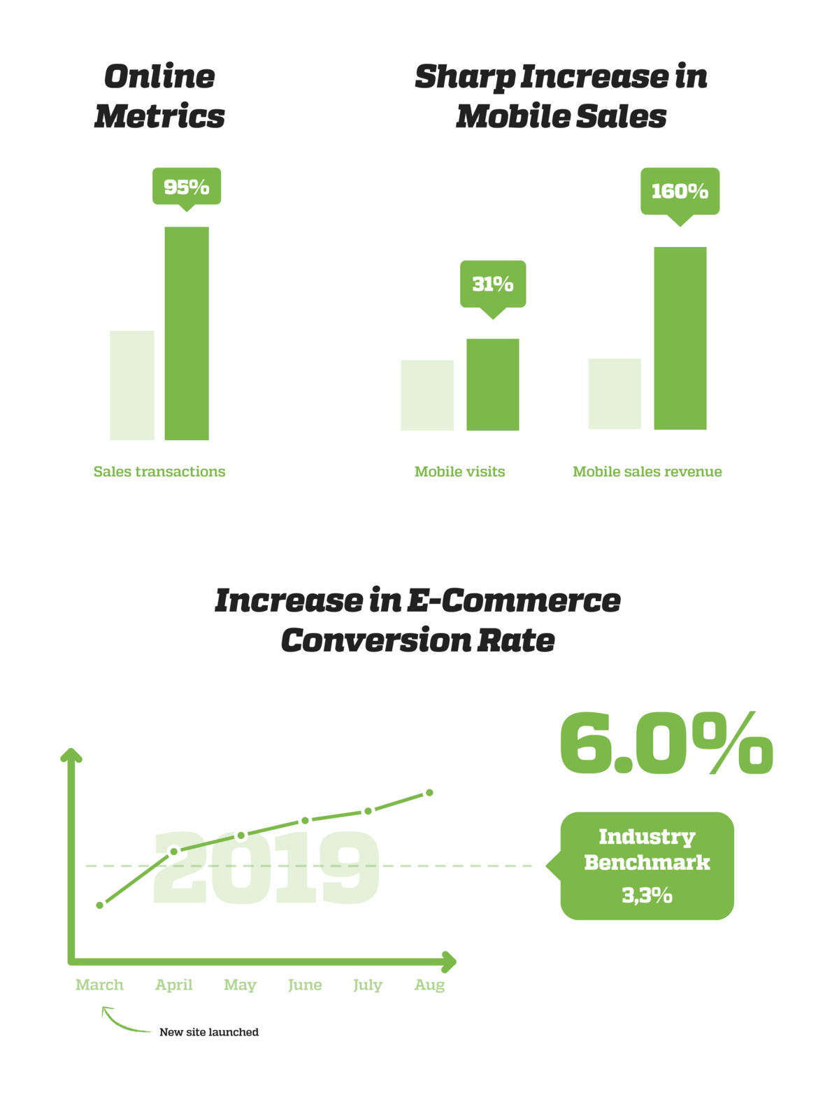
- The increase in conversion rates has been steady and is currently at 6% which is way above the industry benchmark (3.3%)
- Over 19% more people visited the site and user sessions increased by 32%
- Mobile visits increased 31% and mobile sales jumped by a whopping 160%.
- The number of sales transactions increased by 95%
- Automating processes saved the sales team almost 600 working hours per month
Many processes that would previously take 5-7 days and ping-pong emailing with customer service are now completely paperless and can be done in the blink of an eye.
Digital transformation or mindset transformation?
Today, web projects are a never-ending process. In the age of digital transformation online becomes a key part of a business. That being so, there are no time limits for it. The end of a project is just the beginning of its next phase with new development cycles and improvements as an answer to new circumstances with the most important thing being focus on user needs.
The key point of this transformation is not the technology but the mindset transformation in each department or team. It takes a lot more than just following agile principles to accomplish an agile evolution and innovation combined with the adaptation to user needs within multichannel environments. We are happy to have the opportunity to work with clients like A1 digital team that manages these challenges successfully.


