HTML and CSS are the building blocks of web development. While both are relatively straightforward to learn, mastering best practices is essential for writing clean, maintainable, and scalable code.
1. SEMANTIC HTML
Semantic HTML tags add meaning to the content. They improve accessibility and SEO by giving search engines and screen readers more context about your content. Avoid overuse of non-semantic elements like <div> and <span> , opt for more meaningful elements like <nav>, <aside> etc.
1.1. Headings (<h1> to <h6>) for titles and subtitles
- <h1> tag is the main heading (subject of the web page) while the <h6> tag is the least important heading. Keep in mind that each page should only have one <h1>. Having only one <h1> element on a web page is vital for Search Engine Optimization (SEO). It helps search engines understand what a web page is all about (the main idea of a web page). Don't use <h1> and then jump to <h3> when using header tags. It's difficult for web visitors using a screen reader to understand the contents of your web page when you skip heading levels.
1.2. Paragraphs (<p>) for regular text.
1.3. Lists (<ul>, <ol>, <li>) for ordered and unordered lists, and <dl> for description lists to improve readability and semantics.
1.4. Sectioning elements like <header>, <footer>, <section>, <article>, and <aside> to structure the layout.
- <header> element shows the navigation or the opening part of the web page
- <footer> element shows copyright information or navigation links about the web page
- <section> element represents a specific section of a web page with a distinct topic or purpose
- <article> element represents a self-contained composition in a document, page, application, or site
- <aside> element identifies some content aside from the content it is placed in and should be indirectly related to the surrounding content (example: glossaries, bibliographies, pull quotes, sidebars, or even advertisements
1.5. It's advisable to use the <figure> element when adding captions to your images. It is important to use the <figcaption> element along with the <figure> element for it to work. It is important to add captions to your images this way because:
- Search engine optimization (it is easier to find your images on search engines)
- It will be easier for web visitors who use screen readers to understand the content of your web page
- If you use <p> element as image caption: In a situation where the image fails to load you will have the alt text and the text on the <p> element showing on the screen. It will be difficult for a web visitor using a screen reader to tell the difference between the <p> and alt text.
1.6. Avoid using <b> and <i> for bolding and italics because they have no semantic meaning. Use the font-weight CSS property or use the <strong> and the <em> tags instead.
Semantic HTML improves accessibility, SEO, and maintainability.
2. CONSISTENT STRUCTURE AND INDENTATION
A consistent structure in HTML refers to organizing the elements in a logical and predictable way, ensuring the code reflects the content hierarchy and relationships between elements. Indentation involves spacing elements in a nested hierarchy, visually representing parent-child relationships.
HTML does not rely on indentation for functionality. Browsers interpret and render HTML based on the elements and their attributes, not on how the code is formatted or indented. However, proper indentation is important for readability and maintainability. It helps developers and teams understand the structure of the document more easily, especially in larger or more complex projects.
- Consistent indentation (2 or 4 spaces) to make HTML more readable.
- Organizing HTML structure with proper nesting and closing of tags.
- Keeping lines short. Try to break long lines of code, especially within attributes, so they remain readable without horizontal scrolling.
- Using prettier (code formatter). It enforces a consistent style by parsing code and re-printing it with its own rules that take the maximum line length into account, wrapping code when necessary.
Structure is, also, very important in CSS. How you organize and structure your CSS code can have a significant impact on the maintainability, scalability, and performance of your website or web application.
EXAMPLE:
Using ITCSS (Inverted Triangle CSS) - organizes CSS into layers: settings, tools, generic, elements, objects, components…
It is designed to prevent specificity issues by organizing the code in an inverted triangle, from broad to narrow rules.
//_settings.scss
$primary-color: #007bff;
$secondary-color: #6c757d;
$font-family-base: Arial, sans-serif;

//_components.scss
.c-button {
  display: inline-block;
  padding: 0.5em 1em;
  background-color: $primary-color;
  color: #fff;
  border: none;
  cursor: pointer;
  @include border-radius(4px);
  @include transition(background-color);

  &:hover {
    background-color: darken($primary-color, 10%);
  }
}

.c-card {
  border: 1px solid #ddd;
  padding: 1em;
  @include border-radius(5px);
}
Benefits
- Improves scalability and maintainability of large projects.
- Reduces specificity issues.
3. ACCESSIBILITY (WCAG Compliance)
Ensuring that your HTML and CSS are accessible means designing your website or application to be usable by as many people as possible.
3.1. Using alt and title attributes appropriately.
- alt: Provides an alternative description for images, important for accessibility.
- title: Provides additional information, but don’t rely solely on it for accessibility since some screen readers do not read it.
3.2. Ensuring forms are labeled correctly using <label> tags and Use <fieldset> and <legend> for grouping related form fields for better structure and context.
<form action="#" method="POST" aria-labelledby="form-title" id="contact-form">
  <fieldset>
    <legend id="form-title">Contact Information</legend>

    <!-- Full Name Input -->
    <div>
      <label for="full-name">Full Name:</label>
      <input type="text" id="full-name" name="full-name" required aria-required="true" placeholder="John Doe">
    </div>

    <!-- Submit Button -->
    <div>
      <button type="submit" id="submit" disabled>Submit</button>
    </div>
  </fieldset>
</form>
3.3. Enabling keyboard navigation (focusable elements, etc.)
3.4. Implementing responsive typography, where text sizes and line heights adjust based on the viewport size to maintain readability across devices.
3.5 Avoid color and image as the sole method to convey meaning
4. EXTERNAL STYLESHEET
Keeping CSS in external files rather than inline or embedded within <style> tags in HTML. This makes styles reusable, improves maintainability and keeps HTML clean.
5. ORGANIZE CSS
5.1. Writing HTML before CSS (helps to define the skeleton of your page).
5.2. Breaking CSS into smaller, reusable files or sections - common styles for buttons, forms, and grids that can be reused throughout the website.
5.3. Using a CSS preprocessor.
- CSS preprocessors are used to write styles in a special syntax that is then compiled into standard CSS. They extend the functionality of standard CSS by introducing features like variables, nesting, mixins, and functions. By using preprocessors, you can take advantage of advanced features that are not available in plain CSS.
5.4. Using variables in modern CSS (via CSS/SCSS custom properties) to store values like colors, fonts, or spacing units.
5.5 Sticking to class selectors (.classname) for styling. IDs (#idname) are more specific and harder to override, making CSS less flexible
5.6. Avoiding overuse of the !important tag.
- The !important tag can be used to identify properties that are more important than others. This can get tricky as often you’ll end up needing to use multiple !important tags – each to override a previous one in specific scenarios. And doing this too much can cause your site to break or your styles to load incorrectly. Most often, this tag is used as a short-term solution but it often becomes permanent and then can cause issues later when it’s time to debug, in particular.
6. CSS NAMING METHODOLOGIES
Strategies used to create consistent, meaningful, and maintainable class names CSS code. They aim to prevent naming conflicts, improve readability, and make styles more modular.
Most popular CSS naming methodologies:
BEM (Block Element Modifier)
my favorite, although I can still run into problems (look at drawbacks)
BEM is a popular naming methodology that focuses on the concept of breaking down the user interface into independent blocks. Each block contains elements and can be modified with a modifier.
Structure: block__element--modifier
<div class="card card--featured">
  <h2 class="card__title">Featured Card</h2>
  <p class="card__description">This is a special featured card with highlighted styling.</p>
  <button class="btn btn--primary">Learn More</button>
</div>

<div class="card">
  <h2 class="card__title">Standard Card</h2>
  <p class="card__description">This is a standard card with no special styling.</p>
  <button class="btn btn--default">Learn More</button>
</div>
.card {
background-color: $white;
border: 1px solid $gray;
padding: 1em;
border-radius: 5px;
margin: 1em 0;
&--featured {
background-color: $primary;
border-color: $gray;
}
&__title {
font-size: 1rem;
margin-bottom: 0.5rem;
}
&__description {
font-size: 1rem;
margin-bottom: 1em;
}
}Benefits
- Clearly defines relationships between components.
- Encourages modular and reusable code.
Drawbacks
- Very verbose.
- Overuse of BEM can lead to code redundancy.
- The need to define many classes can lead to increased CSS file size.
SMACSS (Scalable and Modular Architecture for CSS)
SMACSS is more of a style guide than a strict naming convention. It focuses on organizing CSS into reusable components and avoids deep nesting (divides CSS into categories)
Structure: Base, Layout, Module, State, and Theme.
<header class="l-header">
  <h1>My Website</h1>
</header>
<div class="l-container">
  <aside class="l-sidebar">
    <nav>
      <ul>
        <li><a href="#">Home</a></li>
        <li><a href="#">About</a></li>
        <li><a href="#">Contact</a></li>
      </ul>
    </nav>
  </aside>
  <main class="l-main">
    <section class="m-card">
      <h2>Card Title</h2>
      <p>This is a reusable card component.</p>
      <button class="m-button is-active">Click Me</button>
    </section>
  </main>
</div>
/* Base Styles */
body, h1, h2, p, ul, li {
margin: 0;
padding: 0;
font-family: Arial, sans-serif;
}
ul {
list-style: none;
}
/* Layout Styles */
.l-header {
background-color: $black;
color: $white;
padding: 1rem;
text-align: center;
}
.l-container {
display: flex;
}
.l-sidebar {
background-color: $beige;
width: 12.5rem;
padding: 1rem;
}
.l-main {
flex: 1;
padding: 1rem;
}Benefits
- Helps with organizing large-scale projects.
- Flexibility in naming.
Drawbacks
- Divides CSS into categories like Base, Layout, Module, State, and Theme, which can sometimes be unclear.
- Scalability issues with larger projects - the structure can become fragmented over time, reducing maintainability.
- Relies heavily on naming conventions, which requires discipline to ensure consistency.
OOCSS (Object-Oriented CSS)
This methodology focuses on creating reusable styles by splitting the visual properties (skin) from the structural properties (container).
Structure: encourages separating structure from skin (appearance) and aims to create reusable "objects."
<button class="button button-primary"></button>.button {
height: 100px;
width: 100px;
padding: 0.625rem 0.5rem;
}
.button-primary {
background-color: $primary;
color: $white;
}Benefits
- Promotes reusability and reduces redundancy.
- Works well for large, complex projects.
Drawbacks
- Increases the number of classes added to an element.
- It may be excessive for small projects.
- Requires a learning curve.
ACSS (Atomic CSS)
Atomic CSS is an approach where each class corresponds to a single, small, specific rule. This reduces repetition but can lead to more class names being used in the markup.
Structure: Uses very small, single-purpose class names for each property.
<div class="p-4 border rounded shadow-md bg-white mb-4">
  <h2 class="text-lg font-bold text-gray-800 mb-2">Atomic CSS Card</h2>
  <p class="text-gray-600 mb-4">This card is styled using atomic CSS classes.</p>
  <button class="px-4 py-2 bg-blue-500 text-white rounded hover:bg-blue-600">Learn More</button>
</div>
.p-4 {
padding: 1rem;
}
.px-4 {
padding-left: 1rem;
padding-right: 1rem;
}
.py-2 {
padding-top: 0.5rem;
padding-bottom: 0.5rem;
}
.border {
border: 1px solid #ddd;
}
.rounded {
border-radius: 0.25rem;
}
.shadow-md {
box-shadow: 0 4px 6px rgba(0, 0, 0, 0.1);
}Benefits
- Great for consistency.
- Easily extendable with new classes.
- Great for fast development and small, reusable components.
- Often used in utility-first frameworks like Tailwind CSS.
Drawbacks
- Can make HTML more verbose (each element may require multiple classes to achieve the desired styling).
- Defining all the necessary utility classes upfront can be time-consuming.
- For developers accustomed to traditional, semantic CSS methodologies, adopting Atomic CSS can require a significant shift in mindset and workflow.
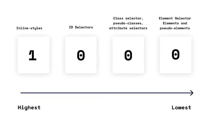
7. KEEP CSS SPECIFICITY LOW
CSS Specificity is a fundamental concept in CSS that determines the order of style application. It is calculated based on the types of selectors used, including inline styles, IDs, classes, attributes, and element types.
Can see it as points 0, 0, 0, 0 and read it like a number 0000
Hierarchy: style attribute -> id -> class, pseudo-class,attribute -> elements
- If the element has inline styling, apply 1,0,0,0 points
- For each ID value, apply 0,1,0,0 points
- For each class value (or pseudo-class or attribute selector), apply 0,0,1,0 points
- For each element reference, apply 0,0,0,1 point
Example:
#my-id .my-class:hover has a specificity of (0, 1, 1, 0) or 110 points.
.my-class p has a specificity of (0, 0, 1, 1) or 11 points.
The rule with the highest specificity wins.
- The universal selector (*) has no specificity value (0,0,0,0)
- Pseudo-elements (e.g. :first-line) get 0,0,0,1 unlike psuedo-class (e.g. :first-child) which get 0,0,1,0
- The pseudo-class:not() adds no specificity by itself, only what’s inside its parentheses.
- The !important value = automatic win.
8. LAZY LOAD IMAGES
Images and other media elements can significantly impact page load time, especially on mobile devices. Properly managing these elements helps optimize performance and accessibility. Using loading="lazy" on images to load them only when they’re about to come into the user’s view, improving performance.
9. REM AND EM FOR SCALABLE TYPOGRAPHY
Prefer rem and em units for font sizing, padding, and margins to allow for more scalable and responsive designs, instead of fixed units like px.
CONCLUSION
Whether you're just starting out or refining your skills, these few practices will help you get started.
Adopting best practices for HTML and CSS ensures that your web pages are well-structured, maintainable, accessible, and performant.