You only get one chance to make a good first impression. That’s the expression, anyway. But it’s especially true about website homepages, which is why we're sharing a strategy-based approach to building your homepage.
Your homepage has to clearly summarize everything about your business, provide a clear definition of the problems you solve for customers, an overview of products and services, plus act as an offramp to other website content and get people interested to learn more. It also serves as starting validation of everything your sales teams do on the ground and gives you online credibility.
Think of it like this. As a user or prospective customer, a good homepage makes me want to continue browsing and find out more about what you do. A bad homepage makes me dismiss your business right away. Yep, it’s a skewed tradeoff, but that’s just how things are.
So, now you’re preparing to build your homepage, the first thing you’re likely wondering is…
Where to start?
According to Semrush, 41 to 55% is considered the bounce rate average. Because of their nature and use, landing pages trend upward with about 70 to 90%. So, even if your homepage isn’t your typical landing page, you can expect a slightly higher bounce rate, depending on your industry or the way you’re funneling traffic.
Today, because of the nature of marketing campaigns directed largely to specific landing pages, it might seem that the homepage has lost a bit of relevance, but that simply isn’t the case because of organic traffic, sales validation and the way customers interact with your site. Even if they initially land elsewhere, most customers still want to have a look at your homepage.
So now, the question to ask is what is the purpose of your homepage? Yes, we just described the general purpose of a homepage, but there are other variables to consider. The amount of traffic expected on the page, organic vs. paid traffic and the rest of your website - how many pages and content does your website feature largely dictates the function of your homepage.
After you’ve answered those questions, it’s time to get to work.
Page level strategy
Although the homepage is somewhat specific in that it can function as a standalone page and should provide all necessary high-level information on everything you do (more so than other pages), it doesn’t exist in a vacuum - unless we’re talking about a one-pager website and even that is closely tied to your brand and other forms of online presence.
This is why you need to build a page level strategy for your entire website which outlines the purpose and desired outcomes for each page. For example, the goal of the blog page can be an offramp to other pages and/or blog subscriptions.
Once you have it outlined, this should also cover the homepage. When you define the goal for the homepage you can move to its elements.
Building a homepage for your ideal audience
The vacuum argument also holds true for your website audience. You’re not building a homepage to cater to absolutely anyone, but rather, you want to focus on the customers you want to attract and offer information which makes them interested in your/product and service.
Before diving into building a homepage (or website, for that matter) make sure you have in depth information on your Ideal Customer Profile and other main audiences you want to target as the majority of the content should address their key pain points and challenges, and how your services, products and solutions help in solving them.
Here is some more information about building your Ideal Customer Profile
Page structure and content
Now, we can move to page content creation. We start by looking at what your homepage needs to highlight - key messages to convey.
The homepage has to start answering the three most important questions a prospective customer is looking for:
- What is the problem your company (via products and services) is solving?
- What makes you stand out from the competition (IE what makes us different)?
- Where is the proof of the quality of your solutions?
Now, we’re not saying that the homepage itself will immediately provide a satisfactory answer to all of these, but it has to provide enough insight into all three for the prospective customer to remain interested, continue browsing and offramping to other parts of the website.
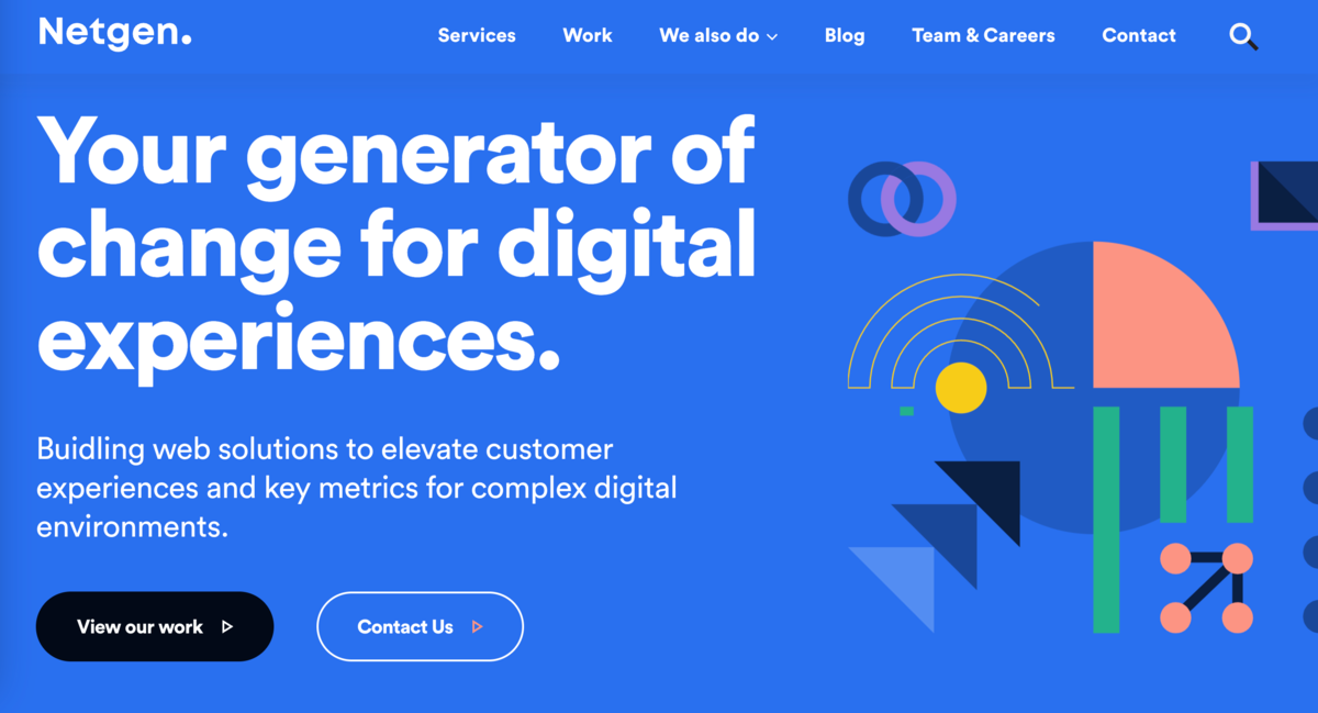
An example of a homepage banner from our recent redesign
Homepage elements
Generally, when we look at structure, the header space, headline and subheadline needs to highlight the first bit of information in order of relevance, listed under 1) in a succinct way, to perfectly introduce your company to website visitors. Think of this as an even smaller version of your company’s elevator pitch.
A great headline is to the point and strikes true – it’s short, clear and perfectly describes what your business does. As far as the subheadline goes, it gives you a bit more room to define your service for customers. Here you’re providing more information about what kind of problems you solve for customers and how you solve them.
Next, we come to - who are you doing this for? You need to showcase tangible results your service, product or solution has brought to customers, in terms of actual bottom line impact on their business. This “second” section of your website is the most important validator that keeps customers scrolling and interested. Customer centricity is key. For any customer, it’s not about you, it’s about what you can help them accomplish.
Populating this part of the homepage with the most important and powerful customer testimonials and numbers acquired from case studies is paramount in creating customer stickiness and follow through towards other pages of your website.
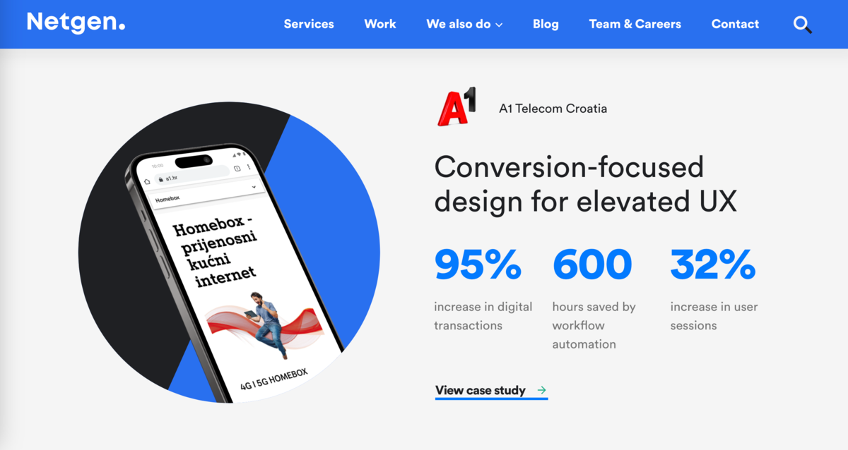
Customer validation is crucial
Call-to-actions also need to serve the primary purpose of funnelling. In my view, homepage CTAs should be limited to three, split into off-ramping customers to your work/case study showcase, giving them a chance for direct contact or purchase or giving them a chance to test out your product.
Usually, most prospective customers that organically land on your homepage aren’t ready to immediately buy or test your product (or contact you) just yet, especially in B2B environments… which doesn’t mean those that are should be blocked from doing so. Quite the opposite.
However, most potential customers will likely need more information from your site and other avenues to be ready for a live discussion or purchase, which is why giving them quick access to the rest of your website through sections of the homepage is vital.
User experience guidelines
Keep your homepage clean and seamless to navigate. Unnecessary components in a homepage layout create unneeded confusion. You want your homepage to serve as an information teaser, not overload potential customers with detailed information which, if your homepage works as intended, they will find on other pages of your site. If they experience information overload as soon as they land on your homepage, they won’t hang around.
This is why it’s key to continue getting contextual feedback on your homepage performance and its UI elements even after launch. In terms of layout, what works best is a max three-color scheme with insightful visuals that also serve as added information for customers.
In terms of visuals, avoid fluff. If a homepage visual doesn’t serve to further and quickly educate the customer on the benefits or functionalities of your product or solution, it acts as an attention grabber for no reason, reducing focus. Use optimized, high-resolution images that represent your brand well, grainy visuals translate to “lazy and unprofessional".
Mobile vs. Desktop
According to The State of Inbound Marketing for 2022, this is the device breakdown for people visiting your homepage. Mobile and desktop are clearly dominant, with mobile users making up 41% of all website visits and desktop users 39%.
Usually, your homepage is one of the most attractive parts of your website, and that attractiveness makes it tricky to translate to mobile, unless you design well from the start. However, because of its primary function it’s clear you need to be able to offer equal quality of user experience and that “wow” factor for both desktop and mobile.
Easily build and maintain your homepage with Layouts
As a company developing complex web solutions since 2002, we’ve developed countless homepages and wanted to make life easier for site builders and maintainers. Our Netgen Layouts, a Symfony-based layout management framework, helps you easily maintain and build websites with little-to-no code and easy-to-use visual blocks.
With just a few clicks, site builders and editors can manipulate and edit a layout of a webpage, add, change blocks and add new parameters to existing ones. Once enabled, a simple drag&drop interface enables visual management and helps you adapt and create your new homepage with ease.
View the Netgen Layouts product tour
Hopefully, this article helped you consider all the variables when thinking about your new homepage. Now, go out there and start building!