- PART 1 -
We are tackling complex problems for our clients on a daily basis. In order to be successful in what we do, we use various apps that make this process easier and faster. There are thousands of apps out there and sometimes it’s almost impossible to choose the right one, but over time we narrowed the selection that best suit our needs.
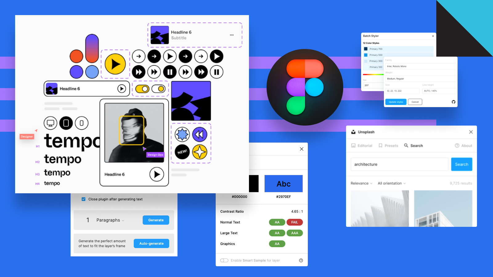
Figma is our bread and butter. We use it for almost everything, from brainstorming, ideation, lo-fi wireframes to final design execution and developer handoff. One of the best things about Figma is that they listen to the community and roll out great features and improvements. Another bonus is a large community of great people who are developing amazing plug-ins which are expanding the core functionality of the app and making it the #1 choice on the market.
Figma resources
A curated collection of the most valuable Figma resources. This is a huge database of everything you can ever think of related to Figma - articles, tweets, podcasts, videos, resources, plugins, books etc. You can even sign up for the weekly newsletter to stay up to date and learn how to use Figma to its full potential.
The biggest collection of free and premium (paid) Figma resources. Here you can find everything from UI kits, templates, icons, device mockups, illustrations etc.
If you want to spice up your designs or slide decks with great-looking animations look no further. Lottie is an open-source animation file format that’s tiny, high quality, interactive, works on any device and easily integrates with the tools you already use.
Figma plugins
Open source plugin with more than 100,000 open source SVG icons grouped in icon sets. Everything from Google Material Design Icons (10.000+ icons), to Phospor, Unicons, Line Awesome etc.
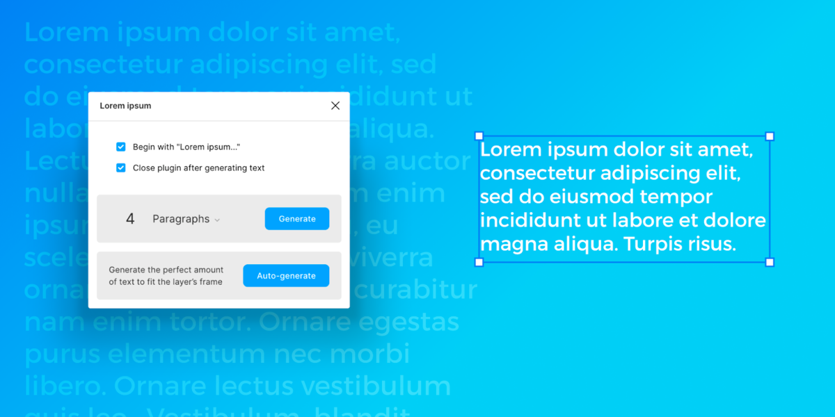
We all need dummy content from time to time. With this plugin, you can generate and finely tune the amount of dummy text directly inside Figma.
This plugin helps you select fonts with a preview of how the font looks. I wonder why Figma doesn’t do this natively.
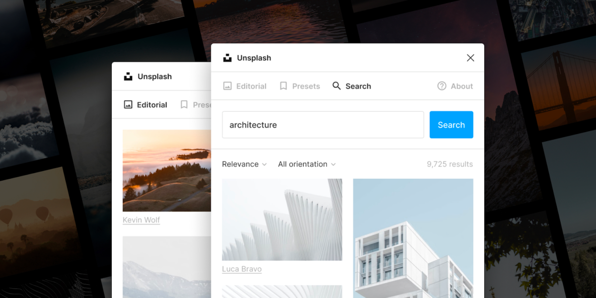
Place images from Unsplash into your designs without having to leave the Figma app. I liked Unsplash much more before they were sold to Getty Images, but this plugin is ad-free and takes you down the memory lane to the good ol’ times when Unsplash was clutter and ad-free.
This one is the same as Unsplash, the only difference is the source.
If you want to quickly generate shades of a selected color try this plugin. There are many similarities in the plugins directory but this one is our favourite.
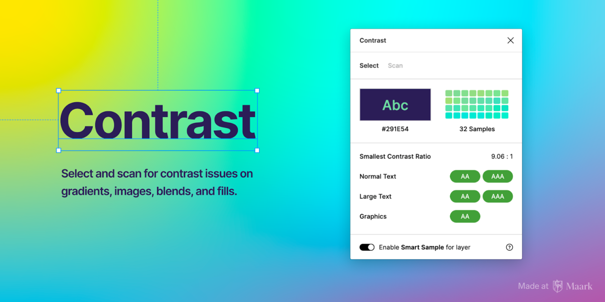
The contrast between UI elements is one of the most important things to keep an eye on while designing and choosing colours, and this plugin helps you stay within WCAG guidelines. We use it all the time because it is free and works great.
Need to spice up your designs with a touch of colour? Install this plugin and generate unique mesh gradients. I don’t know if meshes are still popular or not but there was a time when almost every designer overused them in one way or another.
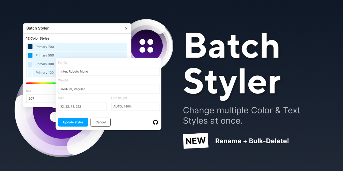
Change multiple text and colour styles at once. No matter if you need to change 2 or 30 text styles, changing from one typeface to another and keeping all font weights and other style attributes are possible with this plugin. The same goes for changing colours that are all based on the same hue value.
Design systems
It’s always good to see what our peers are doing and how they design, name and organize their files. There are numerous great design systems out there, but here are the ones we like and refer to in most use cases. If you want to streamline and speed up your design process then you simply need to have some base understanding of how design systems work.
In our humble opinion, this is the best of the best. Documentation, examples and use cases are second to none. If you’re into UI design or are already an experienced designer wanting to brush up your skills this is the place to go.
Apple Human Interface Guidelines
If you are designing for Apple devices then this is probably the best resource for you. Not as detailed as Google’s Material DS but nonetheless a great collection of content which is going to help you create better user interfaces.
Although some features are locked out and accessible only to Atlassian employees there is still a ton of interesting content here.
IBM’s open-source design system for products and digital experiences. Carbon is open source for anyone to use and contribute back to. Built and maintained by IBM this is a truly great resource for both aspiring and experienced designers.
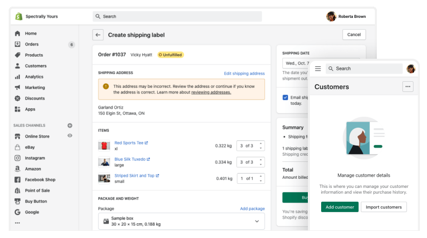
If you’re into e-commerce and want to learn more about best practices then this is going to be a very valuable resource for you. Shopify runs more than a million shops and over time they have really polished their design language. Although it is primarily oriented towards Shopify merchants you can use these guides and apply them to your specific use case.
A publication for design systems creators, designers, developers and managers created by the Figma team. If you really want to learn how to create and maintain design systems regardless if your team is small or big then you need to bookmark this ASAP.
Every good design system starts from the smallest objects. Learn how to create and all that goes into maintaining robust design systems with the help of this great guide by Brad Frost. This is basically an online version of the best selling ebook.
Conclusion
We use everything mentioned here on a daily basis and in some way or another on every project that comes along. All plugins are very straightforward and very easy to implement into your usual routines and workflows. If someone would ask me to pick just one I would have a hard time deciding between Iconify and Batch styler. I know there are countless, more complex plugins out there, but I prefer to keep it simple.
When I start working on a new project one of the first things I do is to check for updates in the mentioned design systems. Google Material is usually the design system I refer to the most. Why? I want to be sure that all my UI elements and UX patterns are aligned with the current practices and methodologies of the best in the business.
This is the first part of the Toolbox series. In the next one, we are going to write about resources, colours and typography.
