Web designer is a general term these days. Most of web designers today have good knowledge about HTML, CSS and even JavaScript. But, in this article I want to talk about the final visual design, designed in powerful software such as Photoshop, Illustrator, Fireworks, or other, which we, frontend developers, slice up and implement into HTML / CSS.
Since most of the projects I worked on are “Photoshop ready” (they are not necessary built in Photoshop, but they were exported to a .psd file) I will use terms such as layers and provide screenshots only from the Photoshop.
Through my working experience as a frontend developer, there were many occasions where I just wanted to pull my hair out. The main reason was a bad visual design in most cases. By “bad visual design” I mean that either the design’s layer structure was unorganized, or it was very hard to mimic all the effects provided in it.
Sometimes a design can be pleasing to the human eye, but that doesn’t mean it’s perfect to work with. To be a web designer, you should be familiar with some basic concepts of web technologies (the more knowledge you have - the better).
Using blending modes in the process of web design
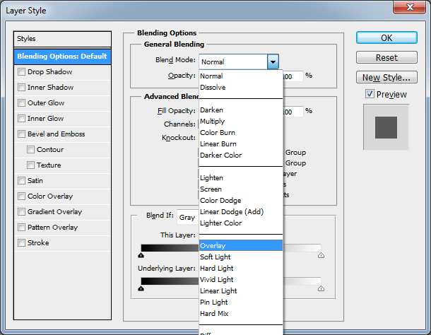
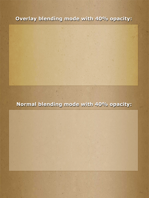
Please, oh please, do not use blend mode in Photoshop, or any other design software tool. The following example refers to an overlay blend mode which is the most common these days. It’s very hard to mimic the overlay blend mode, and the only way to achieve a transparent background is by using opacity instead of the overlay option. A frontend developer will lose a lot of time to get the right color which will fit the original design.
As you can see from the picture below, overlay and normal blendings are completely different. Sure, it’s possible to create the same effect on the web site, but don’t forget that the overlay blending mode depends on the background image, while the normal blending mode is just using the opacity of the current layer. Another important thing is that you can’t save the transparent background of the overlay blending layer without the background on which the overlay layer is applied to. Thus, you should use gradients or some other tools to recreate this kind of behavior.
(NoN)Repeatable backgrounds
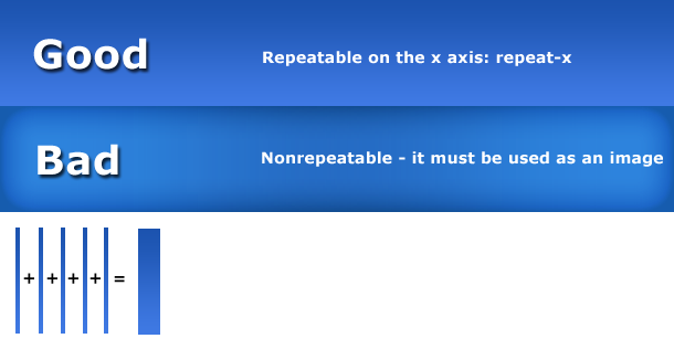
If you want best performance for your site (design), using backgrounds with randomly placed dots, patterns, etc. will be really challenging to any frontend developer. And if you use some gradients on the left and right, with extra shadows on the top and bottom, just to put a cherry on the top, you'll make our day a nightmare of the worst kind. Repeatable backgrounds must be consistent, and you need to pay attention to that!
Responsive design
As the web technologies are constantly improving, designers should pay attention that their design conforms to the responsive design rules if that is possible / required. The worst thing would be to have a design with some fixed backgrounds (such as a main menu, for instance) which will disappear at lower resolutions. A responsive design means that even if a web page should display on smaller dimensions, it still needs to follow its original design (not completely, but the users must have a “feeling” that they are still on the same site).
Some examples of responsive design web sites:
Use a grid system
When it comes to web design, there are some rules to follow. This one is not optional, but it makes our job a lot easier. There are some major grid systems like Bootstrap and 960 grid system, so if you haven’t used them yet – it's never too late to start now!
Be consistent with paddings and margins!
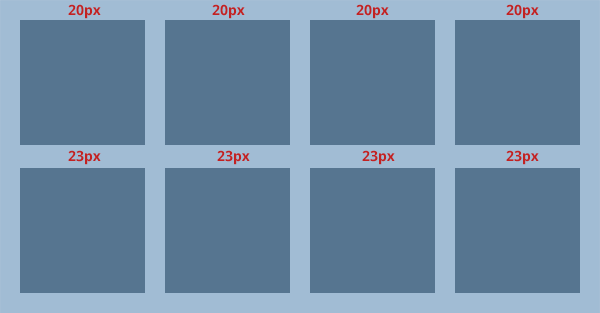
It is very important to keep your paddings and margins consistent. The best practice is to use “rounded” numbers, such as 5px, 10px, 15px. But, if you have a good reason to set your margin or padding to 13px then it’s not an issue. This “rule” mostly applies to blocks on the page (picture below).
As you can see from the picture, all margins are set to 20 pixels, except the one in the middle, which is 23 pixels. This is not logical, and usually a frontend developer must fix this. Okay, now you may think “If you are so lazy to see this immediately and fix it in 2 seconds, you are a lousy frontend developer”. But, what if the designer didn’t calculate any of these 4 boxes, and each box has its unique width and margin? Then we must calculate the box width (all 4 must have the same width), and all margins between boxes must have the same margin. And this is the most trivial example of all.
Getting familiar with common web resolutions
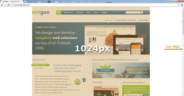
Knowing the basic concepts of desktop resolutions doesn’t mean that you know standard web resolutions. What this means is: if you think that a 1024px wide layout is good – you are SO wrong! You should always calculate the scrollbar, and leave some blank space for the user, so the page can “breathe”. Result of a 1024px wide design on a 1024x768 resolution will be a horizontal scroll bar which will annoy the visitors. Leave enough blank space on the left and right side.
Getting familiar with the media screen concept
As a web designer, you should be familiar with the media screen concept, and all of its resolutions. Most of modern web sites are responsive, so you need to be aware that your client may require that your layout is responsive as well. Be prepared for all web resolutions, and if you don’t know the common ones – learn about them.
Choose your font carefully
Web fonts can be tricky. Most professional clients have access to TypeKit (my favourite) or some other web site / javascript which provides custom fonts. Therefore, before you start choosing fonts, better check with your client which service he / she is using, and based on that choose your fonts from that service. Using @font-face, is advisable too, but if your client insists that a web site works excellent in IE8 or less, then you may need to find another solution. Font face is only partially supported on IE8 (http://caniuse.com/#feat=fontface) and you must test it before your site goes live. Also, it’s highly recommended to choose the font which has language support for the project you are working on.
Gradients or patterns on fonts? Absolutely NO!
Using gradients or patterns on fonts is not recommended unless you know that this piece of text is going to be a background image or a sprite. OK, you are probably wondering: “But CSS3 can achieve this kind of effects! (more or less)”. Yeah, but IE8 can’t, and most of professional clients insist that the web site should work well (or exactly the same) in IE8 as in Firefox, Chrome or some other browser.
Don’t get too “heavy” with the new CSS3 features
There are plenty of cool CSS3 features to use, but since they are not all cross-browser compatible, it’s not recommended to use them too much. Don’t let the design depend on these kinds of effects ( CSS3 box shadows, text shadows, gradients, transitions etc. ), because some clients will require that the website works well in IE7 or IE8, and all these effects won’t be visible.
Conclusion
To sum it all up, here is a basic list of advices which will make every frontend developer job easier:
- Get familiar with the concept of breakpoints in responsive web design and grid systems.
- If you are designing a responsive website, use the elements which can also be reused on smaller resolutions. If it’s not necessary, don’t change the content of the elements (e.g. names of the submit buttons, adding extra content just for the mobile viewport etc.), because that requires usage of JavaScript and generates more load on the server.
- Get some basic CSS3 knowledge, and reproduce its effects wisely in your design.
- Learn more about media screens, and try to design flexible elements as much as you can. If they are flexible, it’s easy to stretch or shrink them.
- Try not to use custom fonts too much. In general, custom fonts look better in Photoshop than on the page itself.
I hope that this little guide was of use to you, and if you begin to implement the advices I have given you, I’m sure your frontend developer will be very grateful.
Photo credit: Designed by Freepik

