Accessibility in UI design is an extensive topic that could be discussed for hours. Although it is primarily oriented towards better user experience of visually impaired people and those who suffer from decreased sensitivity to specific colors and contrast, or generally those with disabilities to perceive, navigate and interact with the web, it also improves the overall experience for all other users.
Accessibility aims to remove barriers for perceiving, understanding and navigating your interface and ensure that nobody is excluded. Just like we should take into consideration users' technical abilities when they are visiting certain websites, we must think of their physical abilities as well. It’s always important to remember that we are designing websites for users, not ourselves.
Anyway, there are many articles that cover the theory behind accessibility, so I’m not going to reinvent the wheel. If you are interested in the theory behind it, you can read articles like:
- Accessibility guidelines
- Accessibility for UX designers
- Accessibility for interaction
- WCAG for designers
However, to make readings easier for you, I would like to share some parts of my designing process, during which I have used some techniques to make interfaces more accessible for all users irrespective of their situation, abilities or context. My tool of choice for crafting interfaces is Figma, but these techniques can be applied in other design tools as well.
Contrast and text size (or the “4.5:1 rule”)
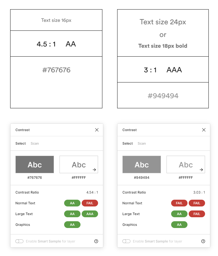
The text size is directly related to the contrast ratio. Generally, the contrast between the text and the background of the text should be at least 4.5:1 (according to WCAG 2.0 guidelines) if the background is a solid color (or all black or all white). If the text is a minimum size of 24px or 18px (bold), it is necessary to satisfy the ratio of 3:1.
It’s surprising how many sites and apps ignore this rule because they want to have a broader set of possibilities and less restrictions to create a visually more attractive interface. I must admit, I’ve also been in that group that neglects usability, giving advantage to aesthetics. However, as I get older and more experienced, I’ve noticed that I have also struggled with low accessibility awareness with various digital products. Many web apps and plugins can help fulfil the condition mentioned above (the 4.5:1 rule), but maybe the best choice is to use the Contrast plugin for Figma.
Contrast plugin in use. The hex value is the lightest grey color that can be used to satisfy minimum contrast ratio requirements.
This plugin offers some great features like “smart sampling” or “scanning for contrast issues”, which can be helpful in some cases. Still, I tend to use the basic method of manually selecting to validate contrast between layers. The main reason to use this plugin is that it can measure contrast with opacity values.
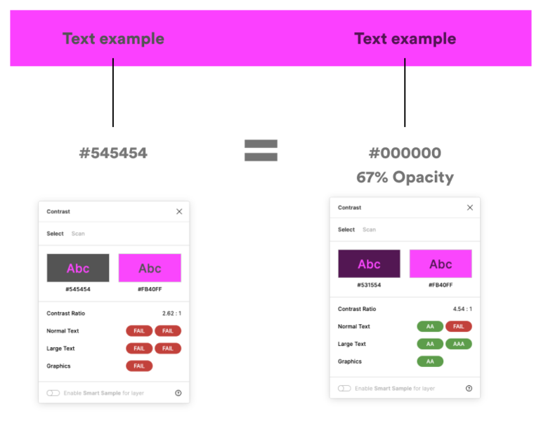
Using opacity instead of HEX values can be beneficial when there is a need to use different colour backgrounds. For example, if you use a grey text layer with the hex value of #545454 and place it on a purple (#FB40FF) background, the contrast ratio will be 2.62:1, which doesn’t satisfy minimum color contrast requirements. If we replace a hex value with pure black (#000000) with 67% opacity (#545454 is equal to #00000 with 67% opacity), then the text layer can inherit some background colours. The contrast ratio is in a safe range with a ratio of 4.54:1. Also, you won’t get an eye clashing moment with visuals and background that your vision can't handle. Nevertheless, you can achieve that kind of purple background masterpiece with the opacity technique also. Still, most of the time, you’ll need to try a bit harder.
HEX and Opacity comparison
Line height and width (length)
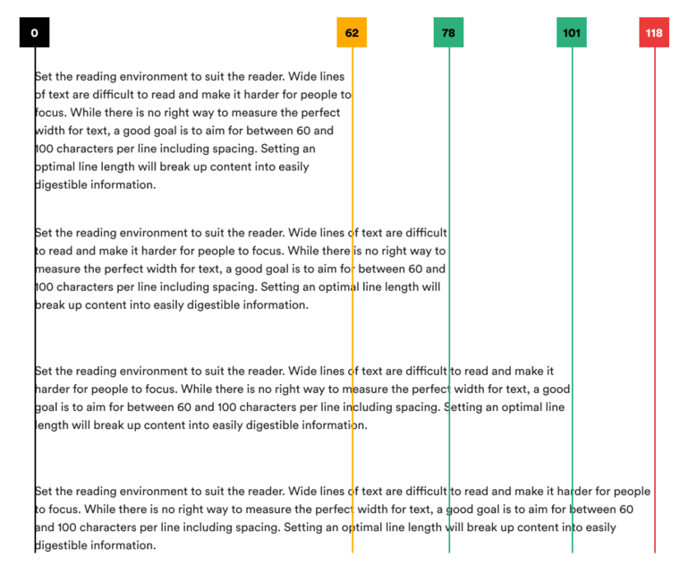
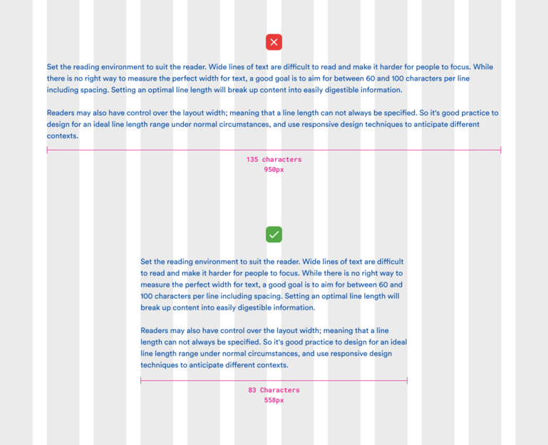
The first segment to set up pleasant content to consume is text length. While there is no right way to measure perfect text length, there is a need to set a balanced block of text information to ensure an easily digestible reading experience. A good starting point is to get between 60 and 100 characters per line, including spaces. You can check out more about it on Atlassian Design System documentation.
Visualisation in length of text paragraph.
Using grid systems can guide you to set the position and length of the text block. The 12 column grid is commonly present in most web interfaces. Mostly is used a Bootstrap grid, and this example is based on that grid. The stats behind the grid are 12 columns, 30px gutter and 68px one column width. That equals 1140px in the overall width. If you are designing an article page, the body content should sit somewhere between 6-7 columns, depending on design choice. Making text width 6 columns (558px), you ensure that the sum of characters and spaces are in the range of 83 characters.
Above (bad) and below (good) example of text length using grid.
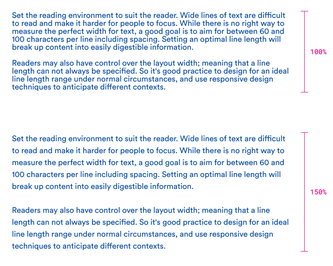
The second segment is line height. Making space between lines of text requires a little bit of math juice. There are various ways to approach this. One of them is to calculate line height based on base font size using ratios like the major third (4:5), perfect fourth (3:4), etc. (more on that on a modular scale tool) or use percentages (%) that represent “em” values on the front-end side. The method is, the bigger the font, the smaller the percentage value needs to be used.
In the image below, you can see the text paragraph using a value of 100% of line height and with a size of 16px, where text lines are squashed near to each other, making the reading experience really difficult for anyone, not just for a person with some kind of disability.
Example with too small and ideal line height.
To ensure the safe-bet method, use a 150% value or more for the text size of 16-18px or less; smaller text size = bigger or equal line height. For text size bigger than 18px, use smaller than 150%.
Example with too small and ideal line height.
Visual clues
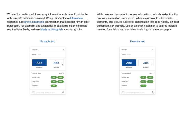
Basically, don’t just use colour to indicate important actions. Even when the colour contrast is perfect, it doesn’t ensure good eye scanning possibilities for people who suffer from colour blindness. In the example below, if we use grayscale colour filters to simulate “Achromatopsia”, we can see that text links are tough to see even though the colour contrast is 8,49:1. This is an extreme example because achromatopsia is very rare, but you get the point. Adding some visual clues to those text links, you can get noticeable improvements in visual distinction.
Normal vision (left) and monochromatic vision (right)
Examples of visualities you can add are various. The underline and bold text are just two of many possibilities.
Example of adding visual clues to text links.
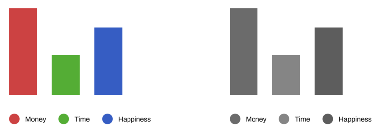
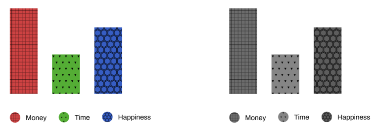
Making content accessible is not just making text “visible”. There are more types of content presented to the audience, such as various sorts of graphic elements, like charts and infographics. With poor contrast in colour, it is hard to distinguish the variance of data types. So, there is a need to style the chart shapes with appropriate contrast and patterns.
Example without patterns
Example with patterns
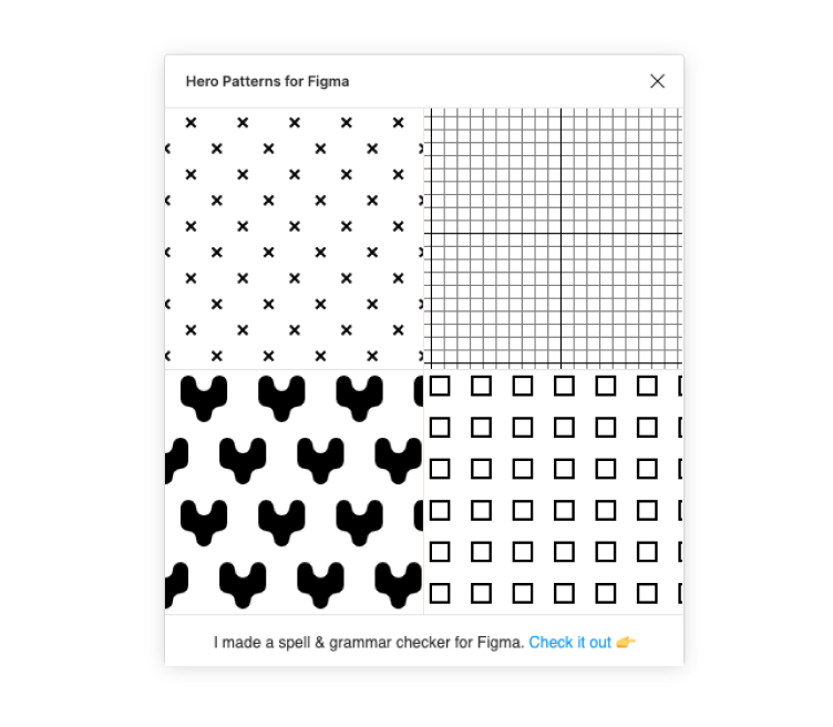
To simplify the process of adding pattern background, there is a plugin called “Hero patterns for Figma”. It’s not ideal, but it’ll help to speed up the process.
Hero Patterns for Figma plugin
Functional spacing and naming items
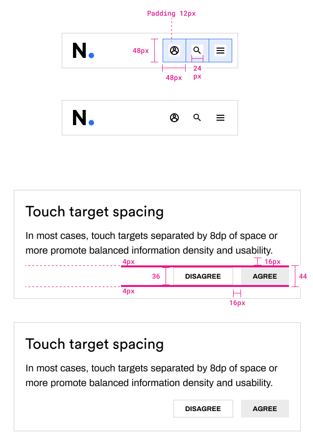
These days it’s well known that most people access websites through mobile devices to take certain actions (confirm statements, buy products, cancel orders, etc.). In order to proceed with these activities, most of the time people use their fingers, and there are many variations in finger shape and sizes. To ensure enough space for the touch zone,two tech giants, Apple and Google, have set the guidelines for dedicated spacing around CTA (call to action) spots. The values are somewhere between (44-48px or 7-9mm), representing the minimal surface of touch target space.
Safe zone for main actions
When icons represent action points (mobile sites or apps), there should be appropriate naming alongside the icon itself, ensuring informal communication with the user. Some icons don't have to be labelled because of overall global recognition. Like the example below (search, cart, profile page and menu).
Standard icons in most use cases
In other cases, without labels, it is hard to decipher what is the individual action for.
Vague meaning
Labelling actions is helpful for every type of user to navigate and use an app or website, not just for accessibility reasons.
Clear meaning for main actions
Input fields
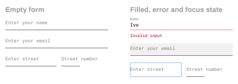
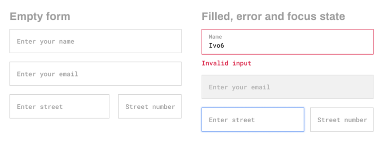
These days, we are witnessing a diversity in styles of form inputs. The question is, which one of them suits best for users to interact with. In previous years, Google has set the trend of minimalist styling fields by adding horizontal lines at the bottom and discarding conventional borders around the whole shape. With this trend, a big part of websites followed this approach. This style has a place in some cases. Still, in most other ones, it's hard to identify attributes and scannable boundaries for reading and entering information into it.
Example with empty state (left), and filled name, error and focus state
The simple example on the left can be seen as the first pain point with placeholder text (the street number). In ideal examples, some short label text works fine, but what if there is a need to describe the field purpose with more than just one word to indicate usage, like street number, which is in many cases just a two or three digits number and a single letter? Then, there is a problem. A list of problems will occur when the interaction with fields happens like error, focus, disabled state, etc. There is a need to add more space between sections to separate fields, indent values inside fields for focus and disable states. The result is a messy list with unclear information scannability.
The same situation can be improved in many ways. Still, for the sake of simplicity, the short solution can be made by adding boundaries for each field. That way, it's more accessible for tap target and visual distinguishes. Other improvements could be placing the label text above the input box and grouping fields in the same category to divide complex forms.
Focus states
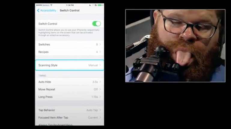
Maybe the most underrated subject in web navigation functionality is the focus state. Many sites these days have no well-defined focus state. This “feature” is a must in the accessibility approach. Here is an example from a video where it is shown how some people navigate through content without mouse or even a keyboard: https://youtu.be/oi3__pUK3C4?t=142.
This example shows how important it is to implement a focus state on apps and websites because you never know how a user will interact with a product.
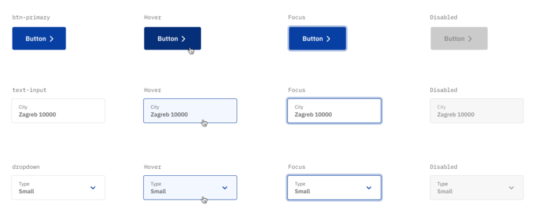
For design implementation, there isn’t any available plugin, as far as I know. The best way is to have some prepared template and reuse it with project-based modifications.
Some basic templates are shown here:
Visual clues in forms
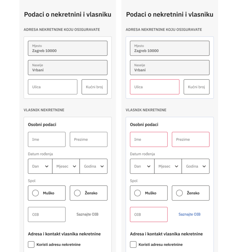
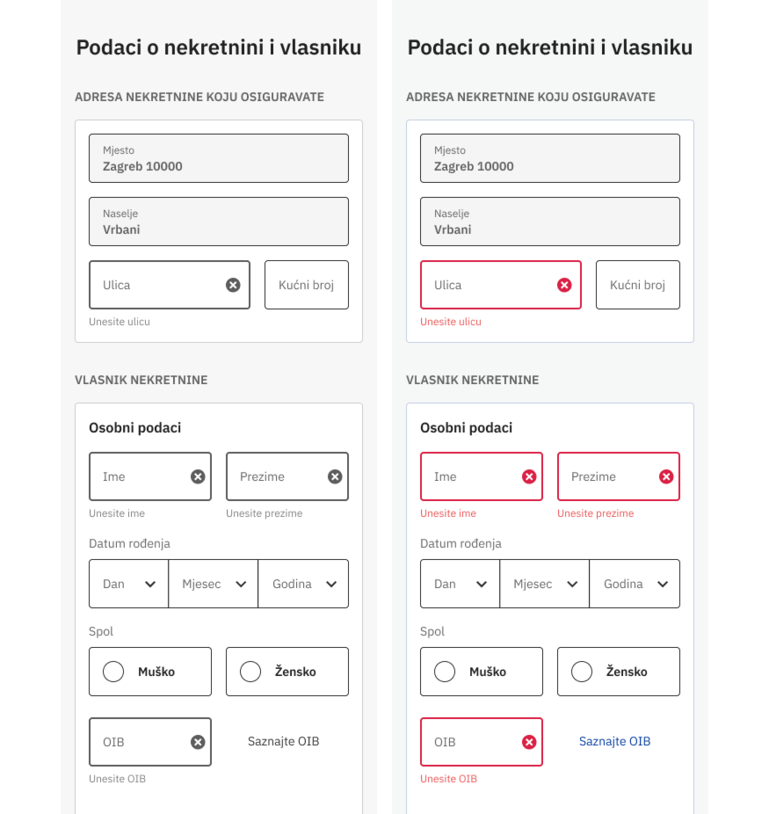
As mentioned before, making differentiation only with colour isn’t the best way to help users indicate specific problems or navigation hints, especially in complex forms. From the example below, it’s hard to tell where error states are.
To find the solution for this and other problems related with accessibility, it is necessary to acquire the habit to think about interactivity problems that could happen when the user interacts with the product. Adding visual clues, like icons, larger borders, better contrast and adding helper text can make things relatively better. Comparing these two examples below is quite obvious.
Final words
As previously mentioned, the accessibility in web design is quite a broad topic and we've covered only several segments in this blog post. However, it is important to have accessibility in mind right away in the early stages of the design process.
The problem arises with UI designers and programmers on one side, and regular users on the other one. For designers and programmers, it's rather obvious how things should work, but sometimes they forget that there are other users, who are not that familiar with modern technologies. Therefore, designers and developers can be more helpful in that direction, making sure to use every possible visual clue so the regular users can understand web products as smoothly as possible. As the time goes by, this awareness about accessibility will grow, because the current statistics show that more and more people require better and more accessible digital products.
